
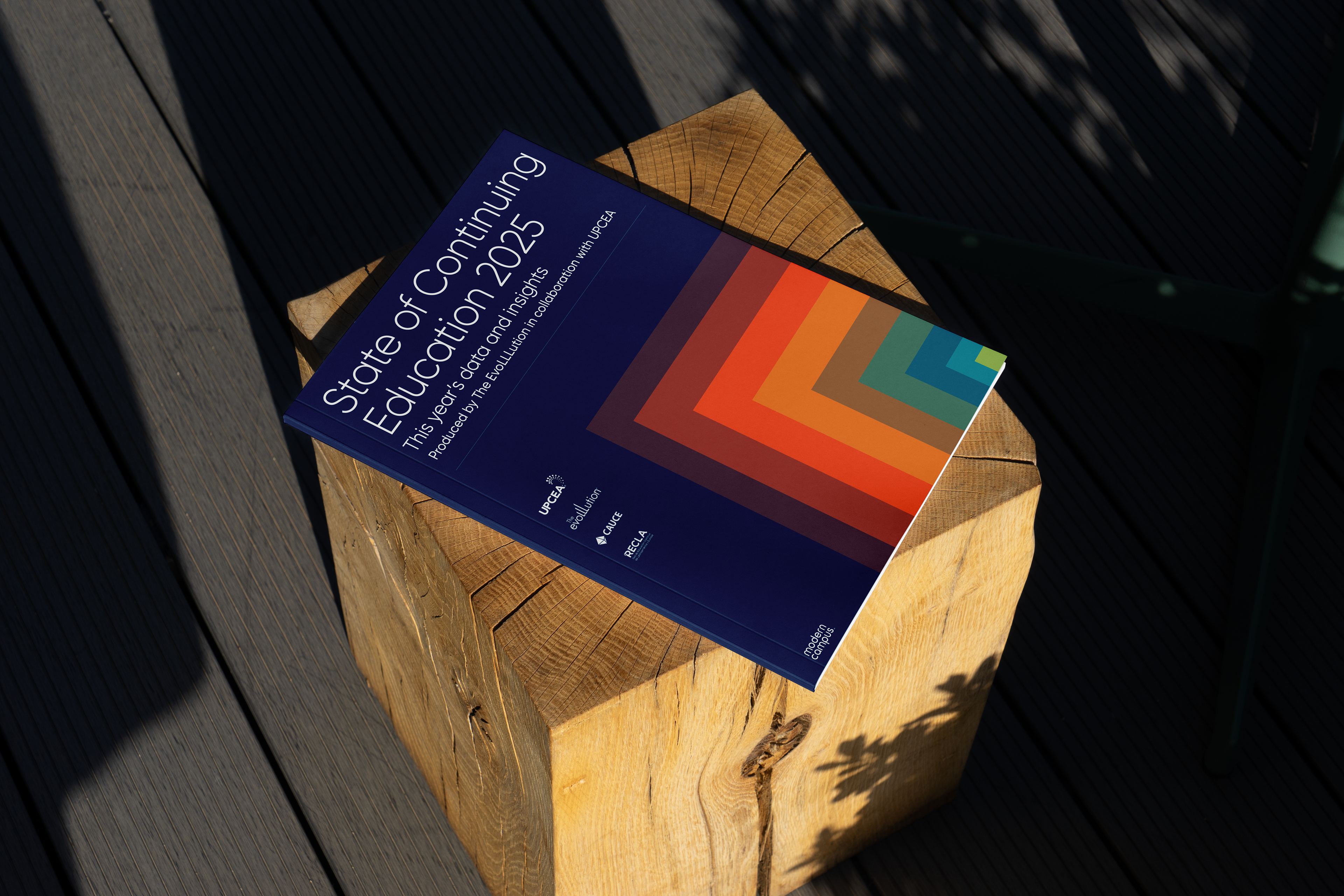
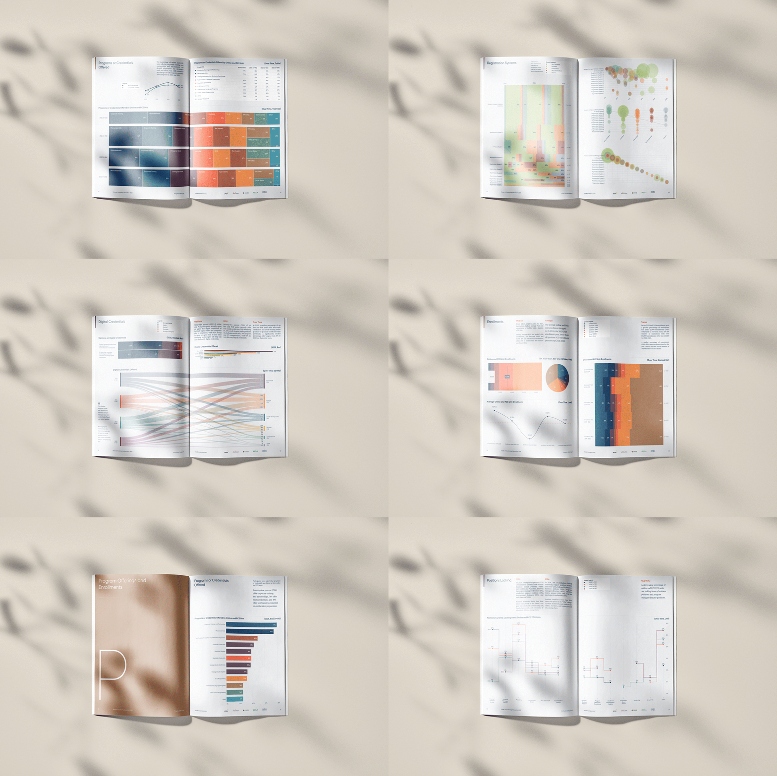
State of Continuing Education 2025
Research Report and Data Visualization
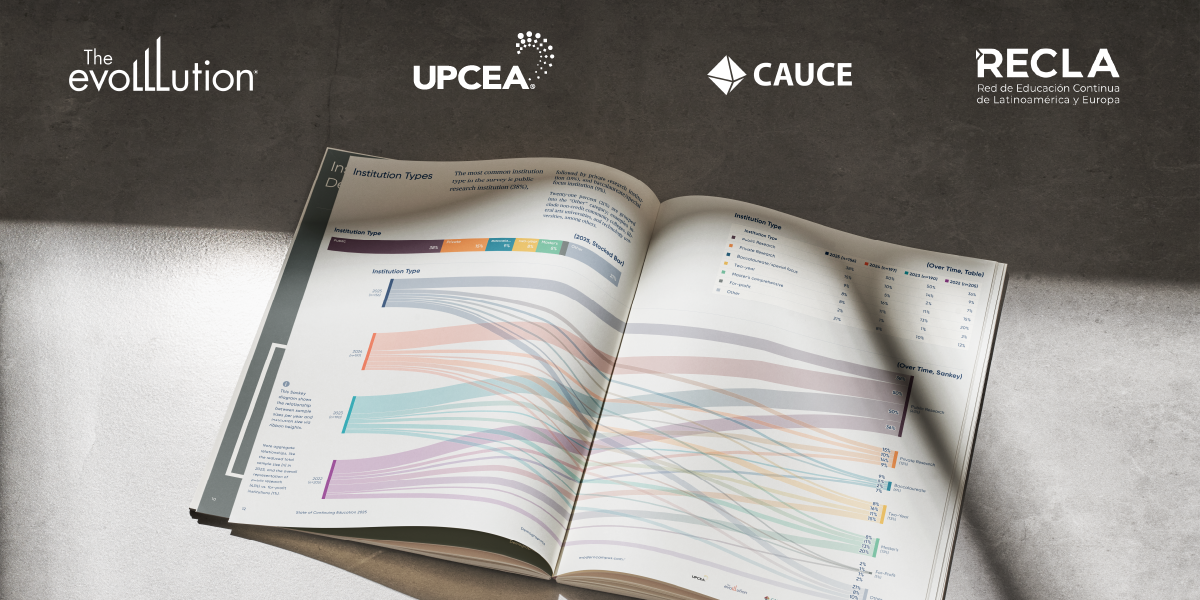
This report was conducted in collaboration with The EvoLLLution, UPCEA, CAUCE, and RECLA who supplied survey data from higher education institutions across the Americas.
Data Visualization Method
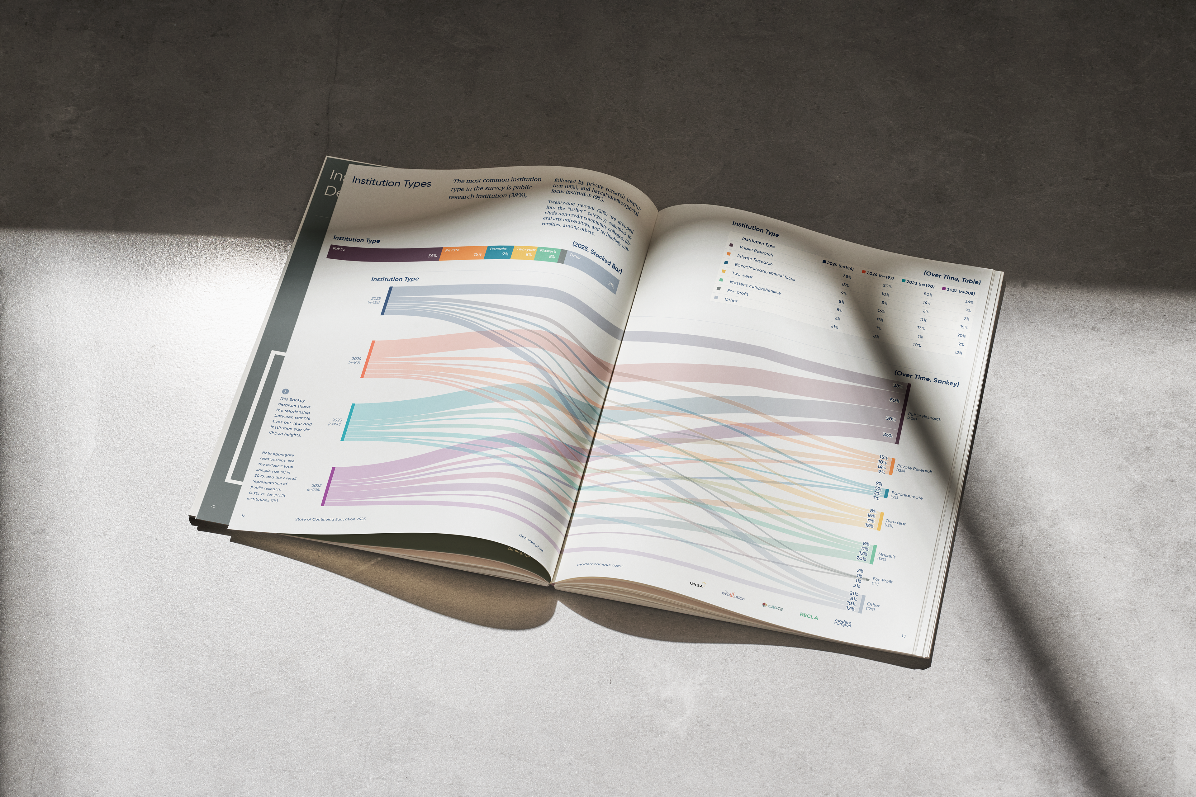
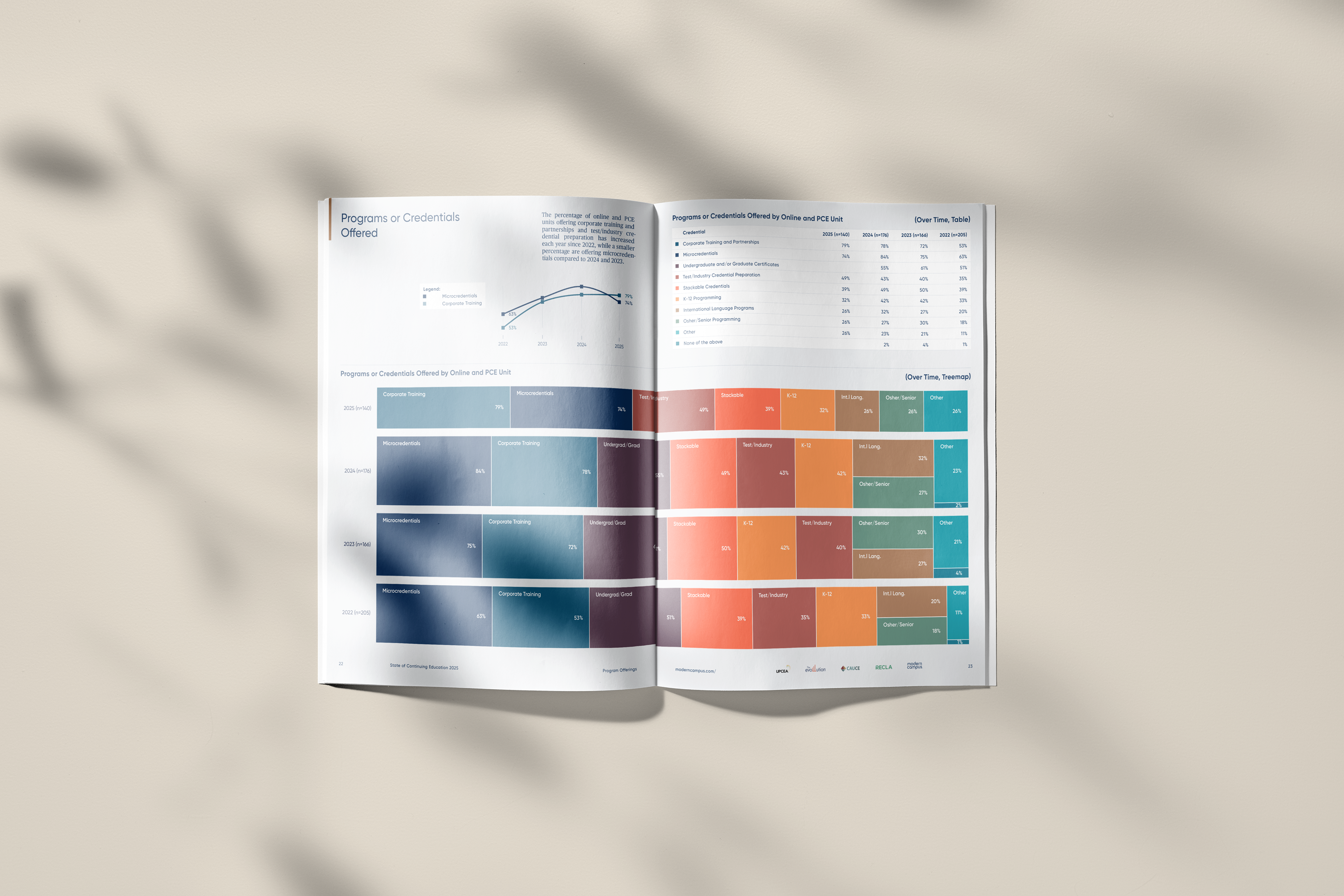
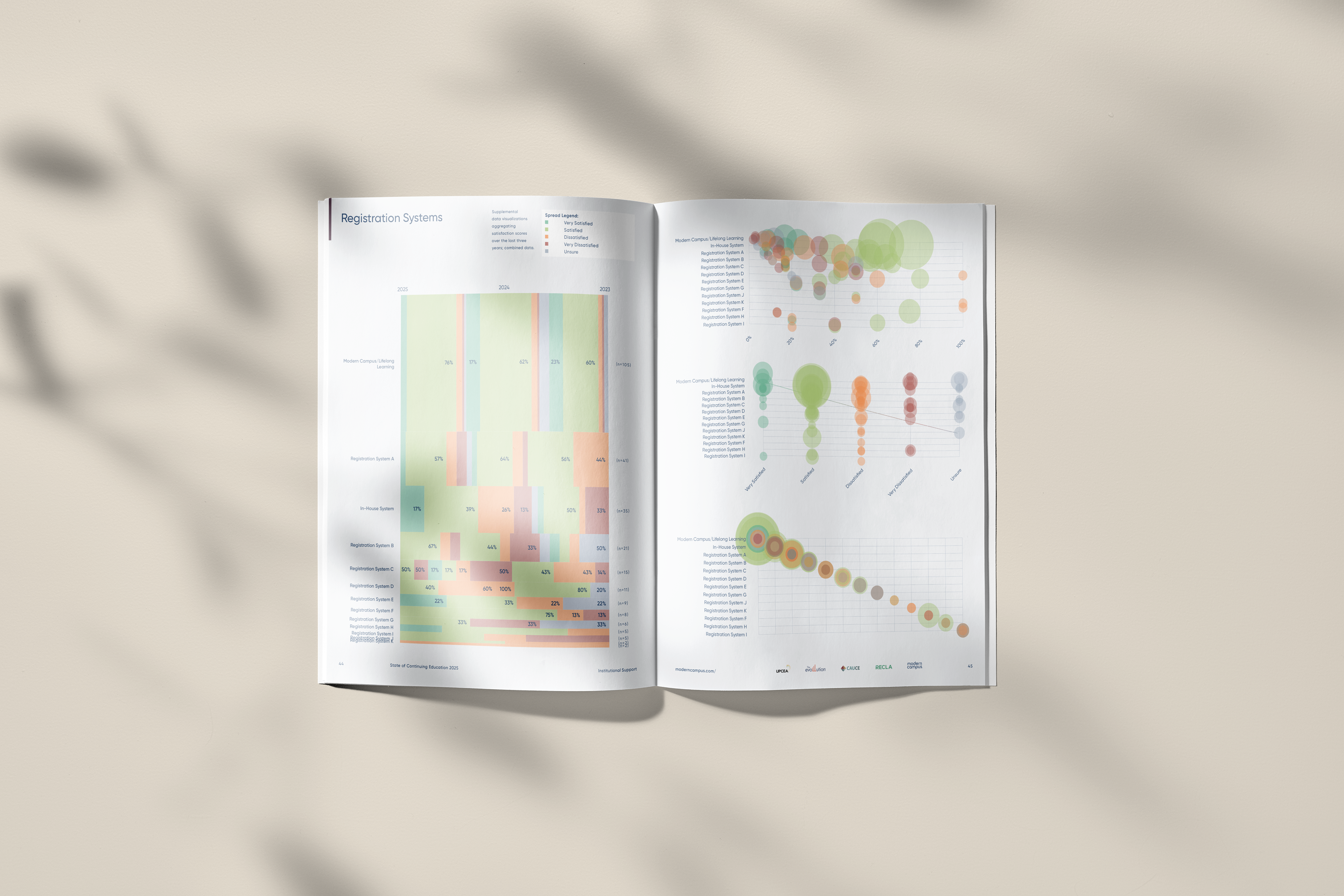
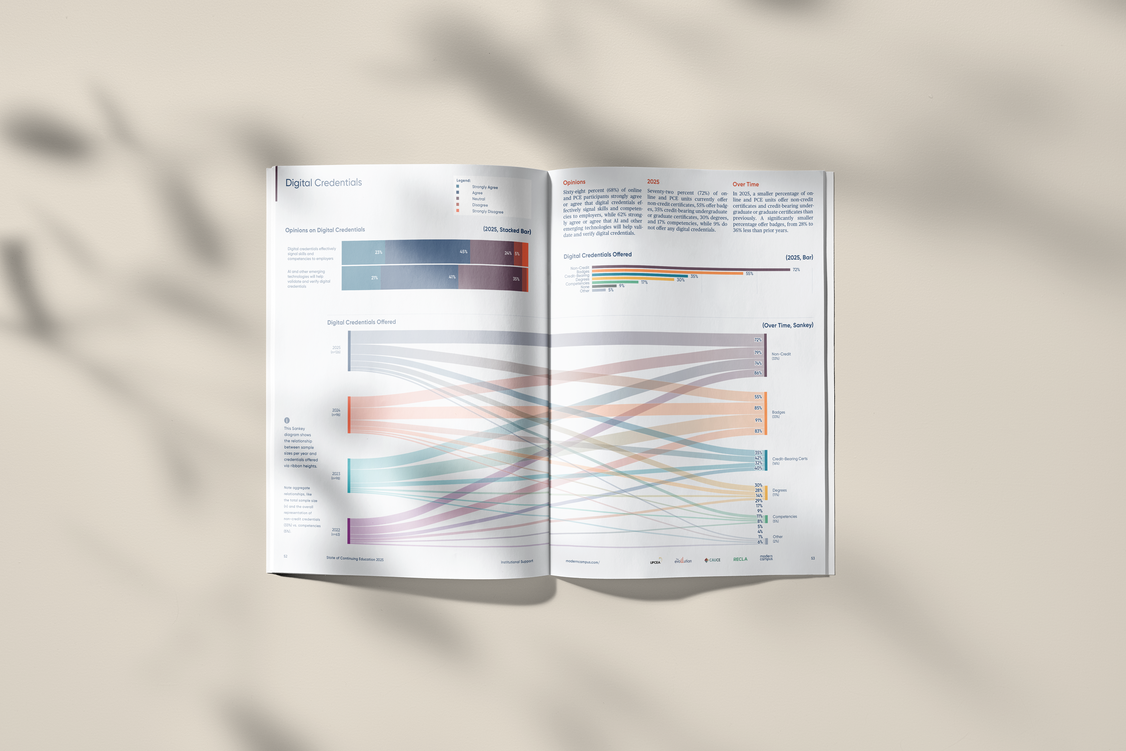
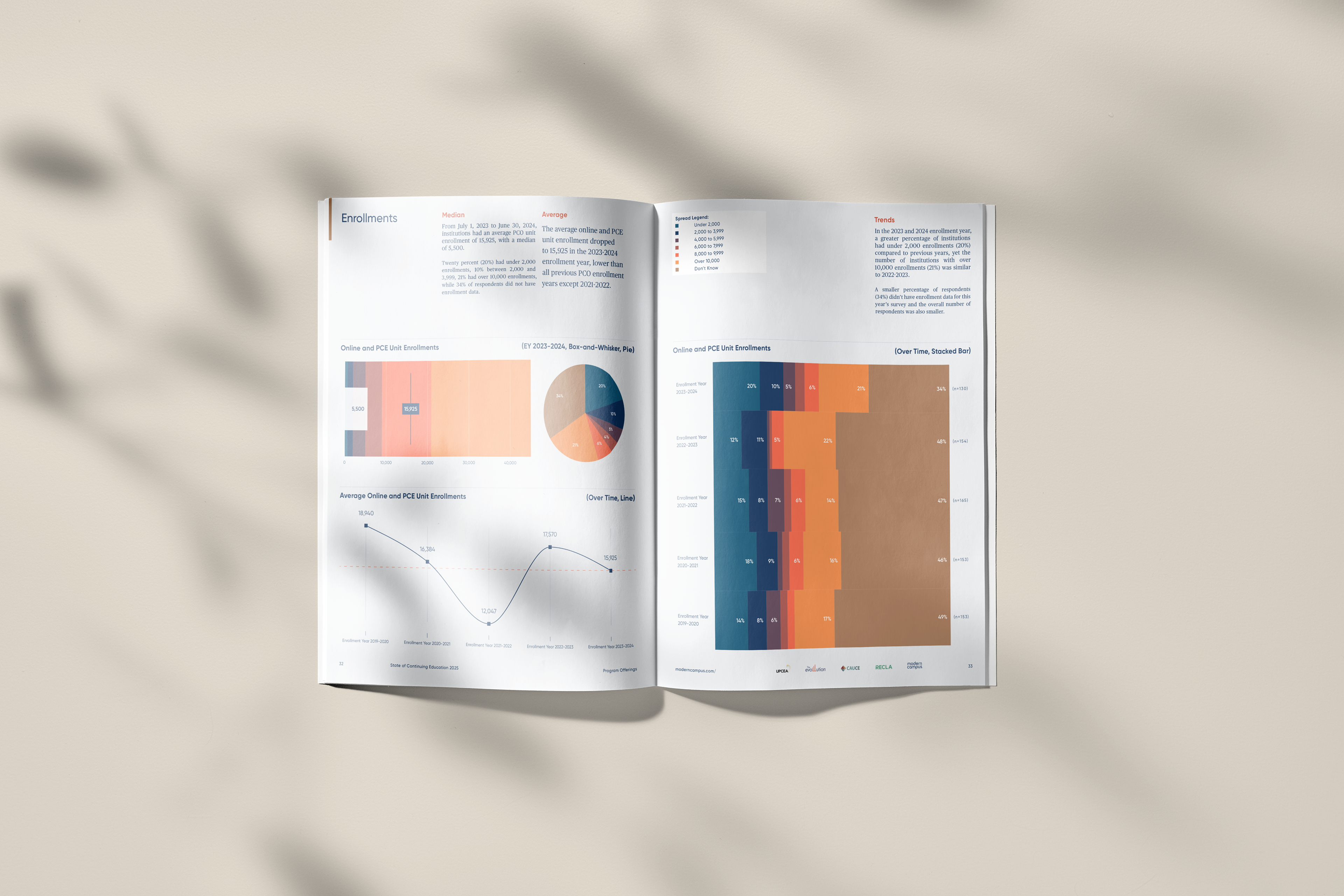
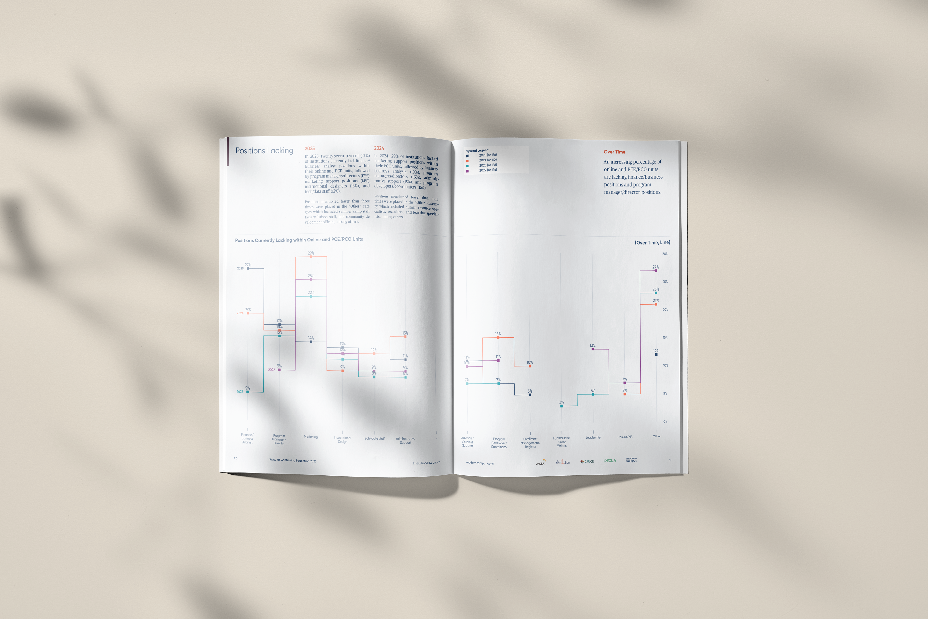
This report contained cumulative and comparative data from the last 4 years, so a more robust system for visualization was needed than in previous reports.
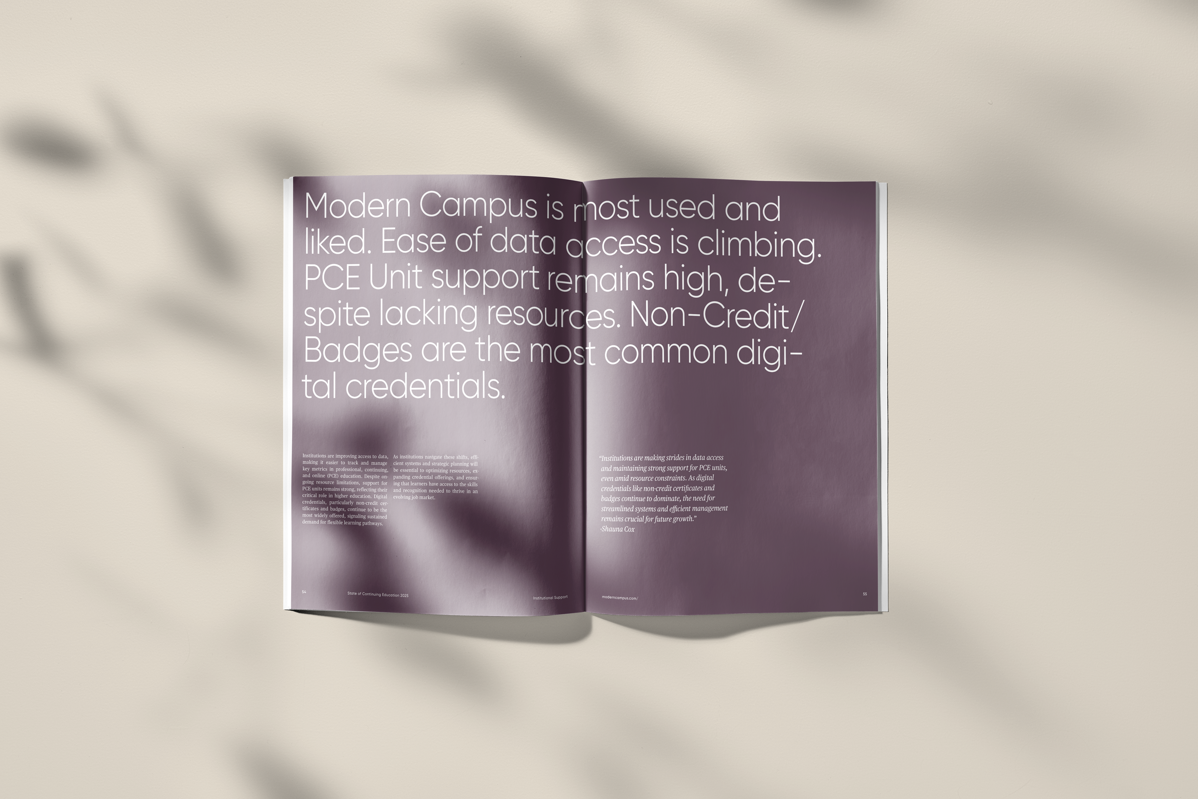
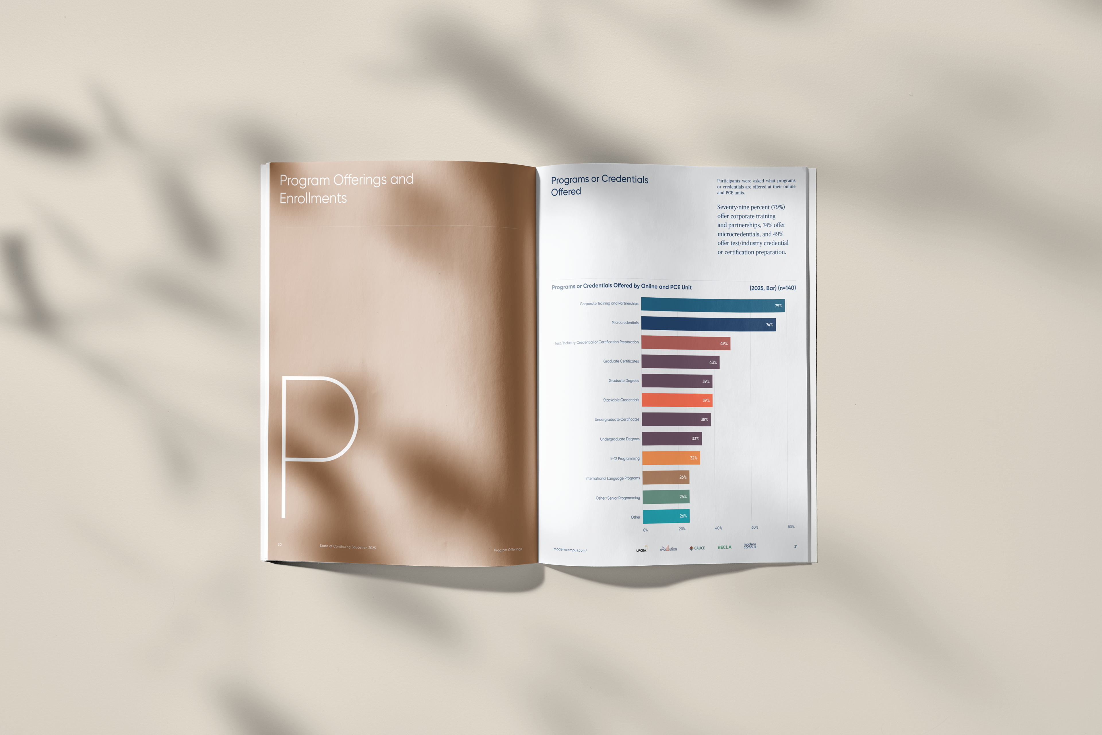
To accomplish this, I created a tertiary palette comprised of blending brand colors and distilling swatches from the steps. This process allowed me to create a broader spectrum to colorize charts and graphs. The new colors are universally attributed across spreads and, in some cases, sections, to further clarify relationships between data sets.
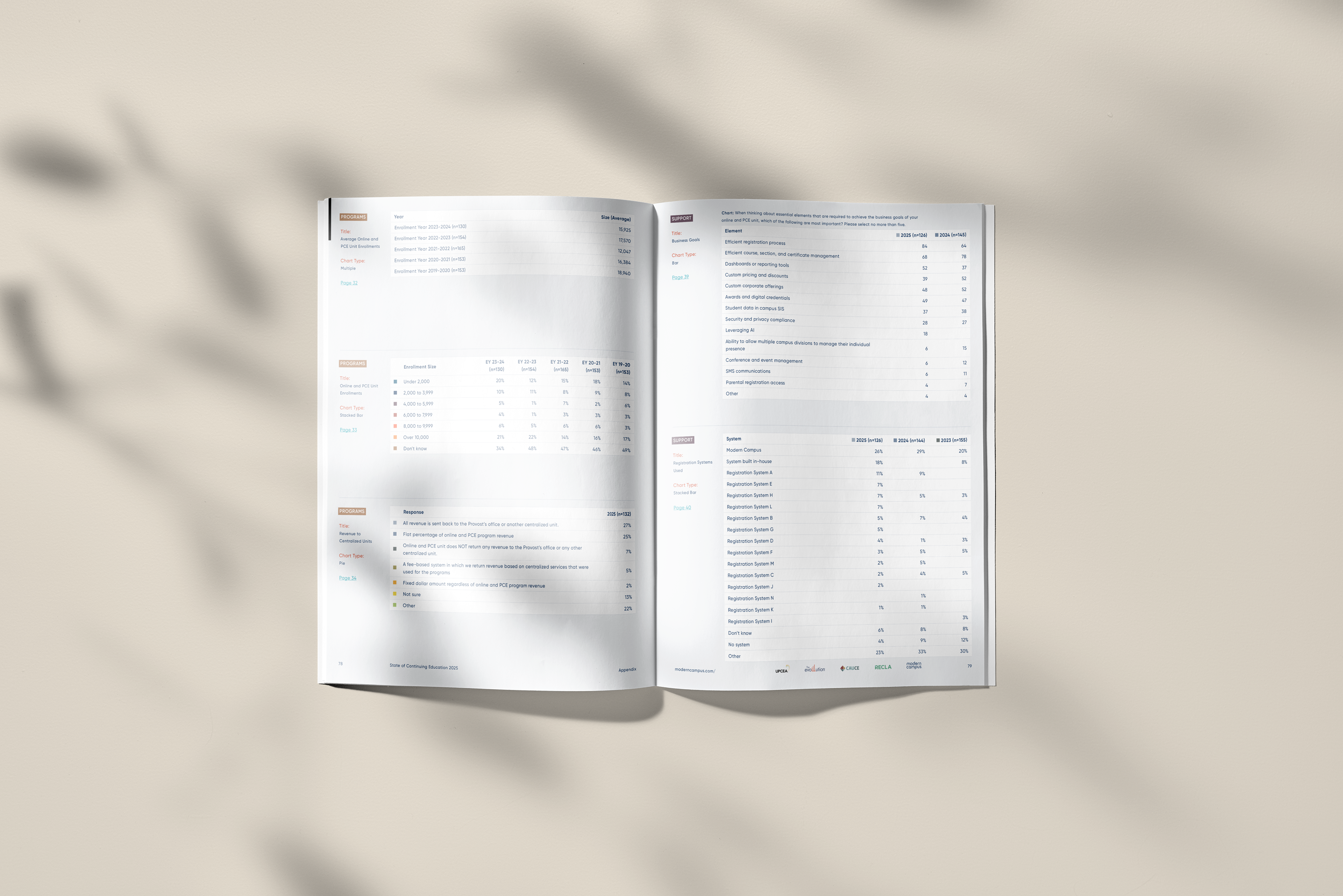
Since the data is displayed in highly visual fashion, an appendix was included featuring tables containing raw figures. These tables are also color coded, when applicable.

Thank You!
astravisum.studio/