
Modern Campus User Conference
October 7-10, 2025
Chicago, Illinois
Higher education thrives on community. Whether it’s students finding belonging on campus, faculty collaborating to enhance learning, or administrators leveraging technology to transform the student experience—progress happens when we come together.
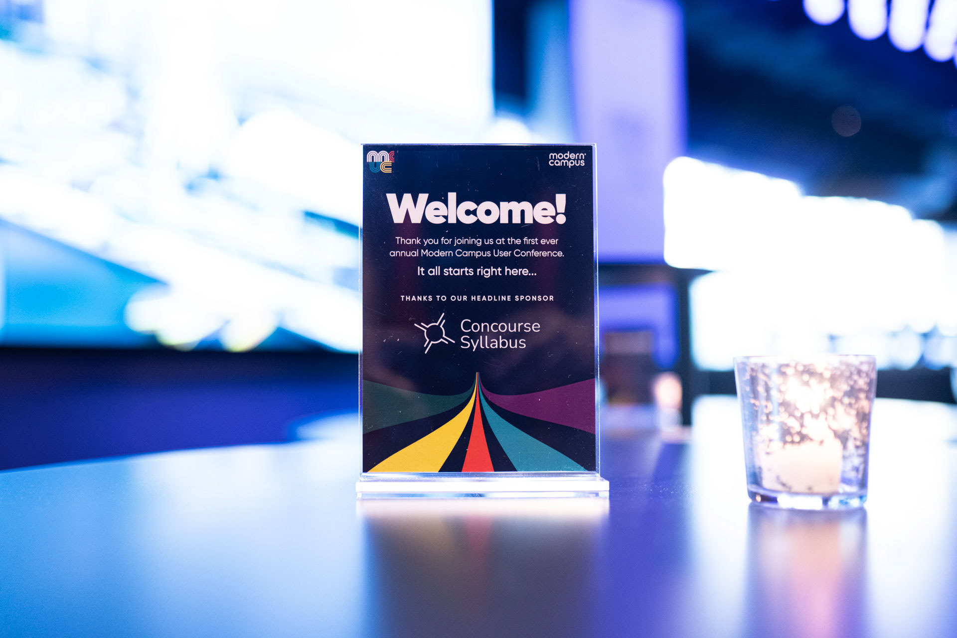
This year’s User Conference theme is Unite & Innovate: The Power of Community in Higher Ed. Uniting, innovating, and building trust with our valued customers. This is more than just a conference - it’s a space to connect with peers who share your passion for creating a more engaging, student-centered future.
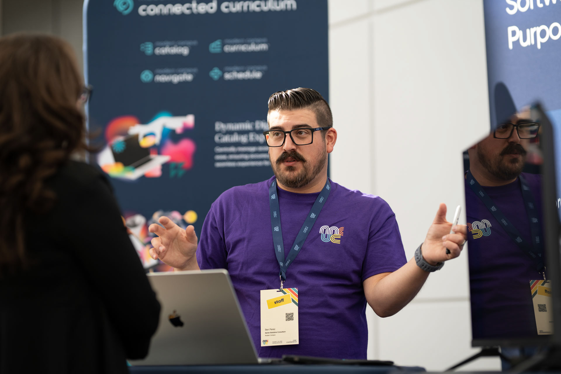
The goal of this conference was to bring our customers all into one place to foster collaboration, networking, and primarily, to drive organic cross-sell through conversations and panels that showcase our suite of solutions that current customers may not know about.
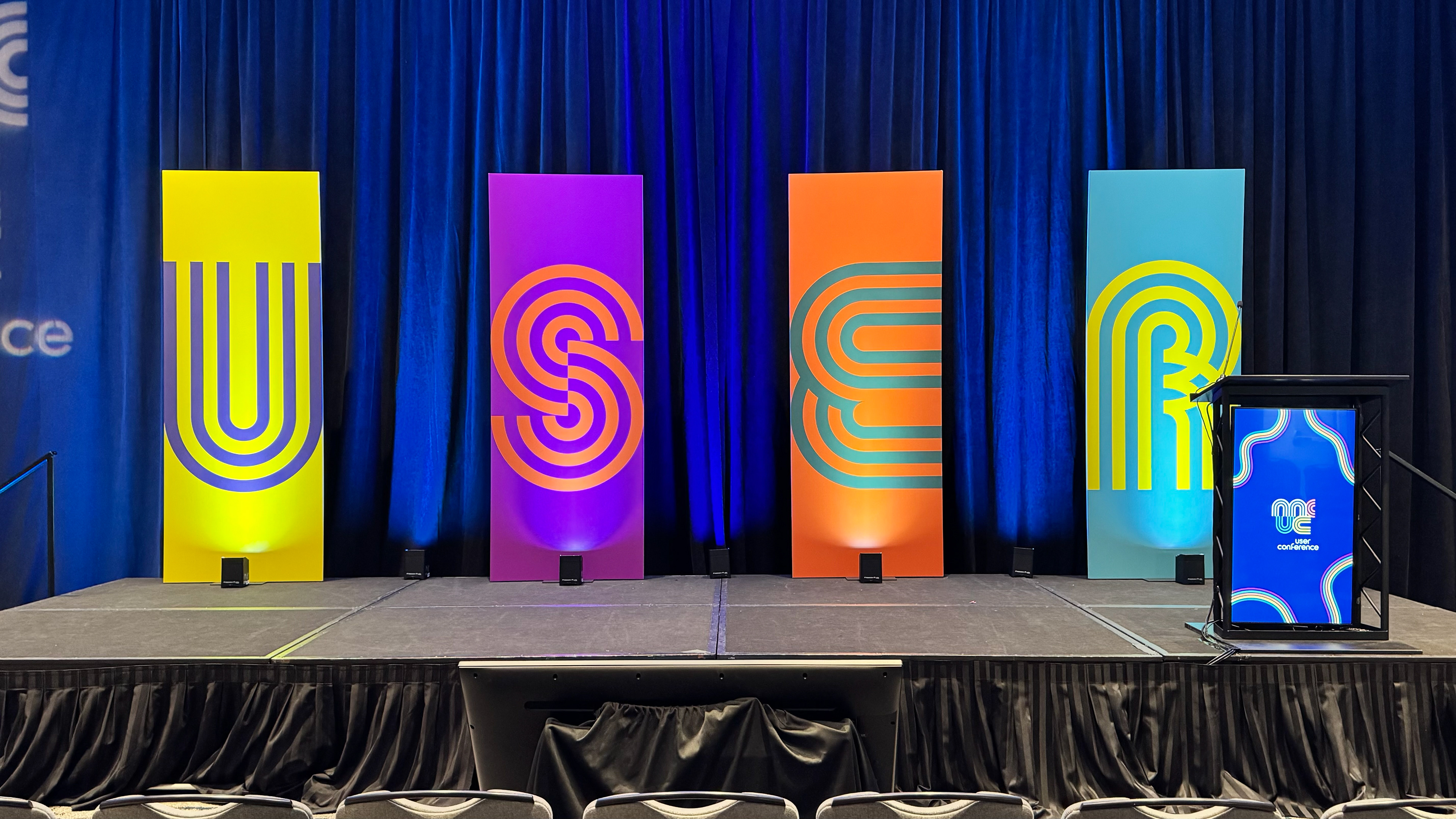
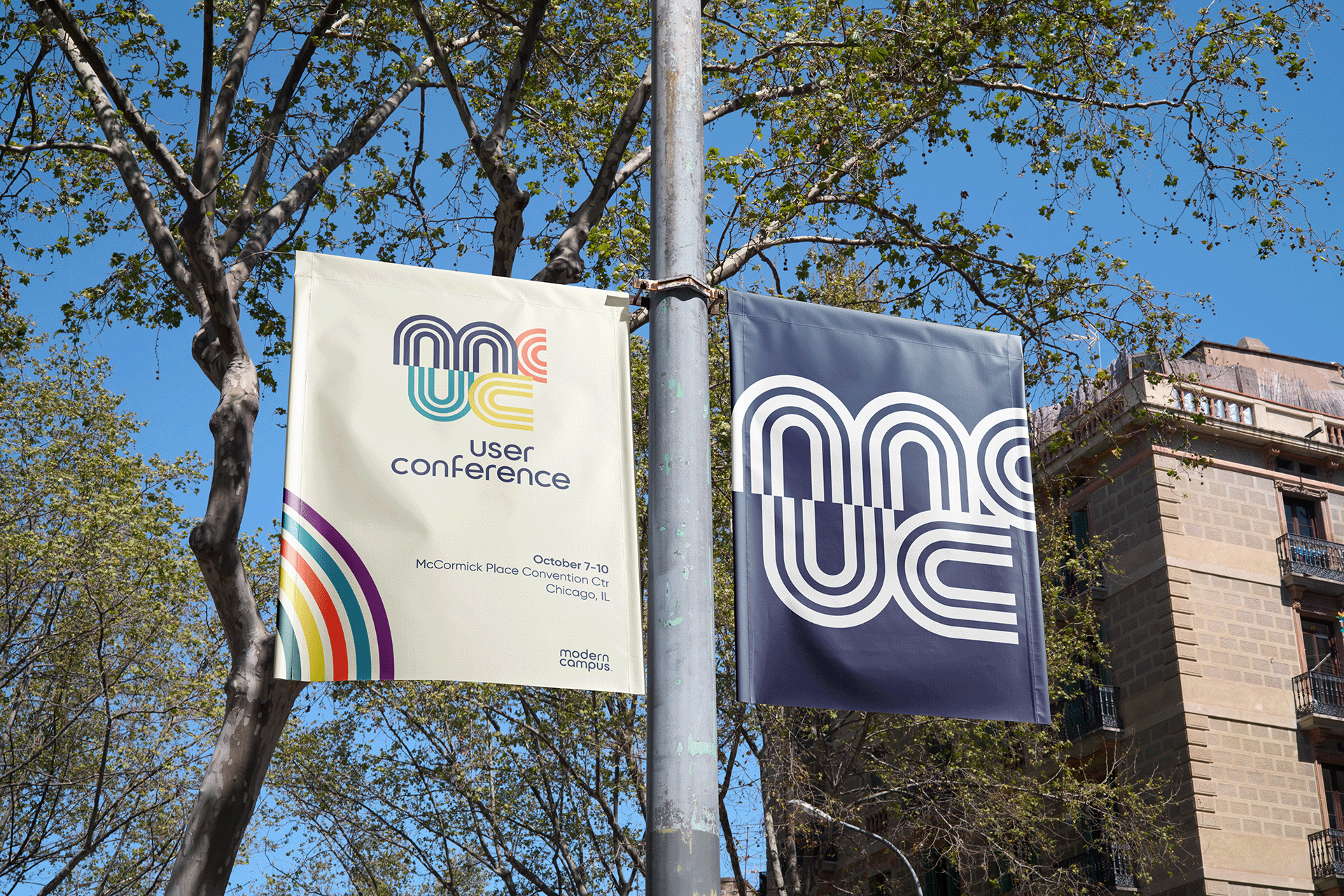
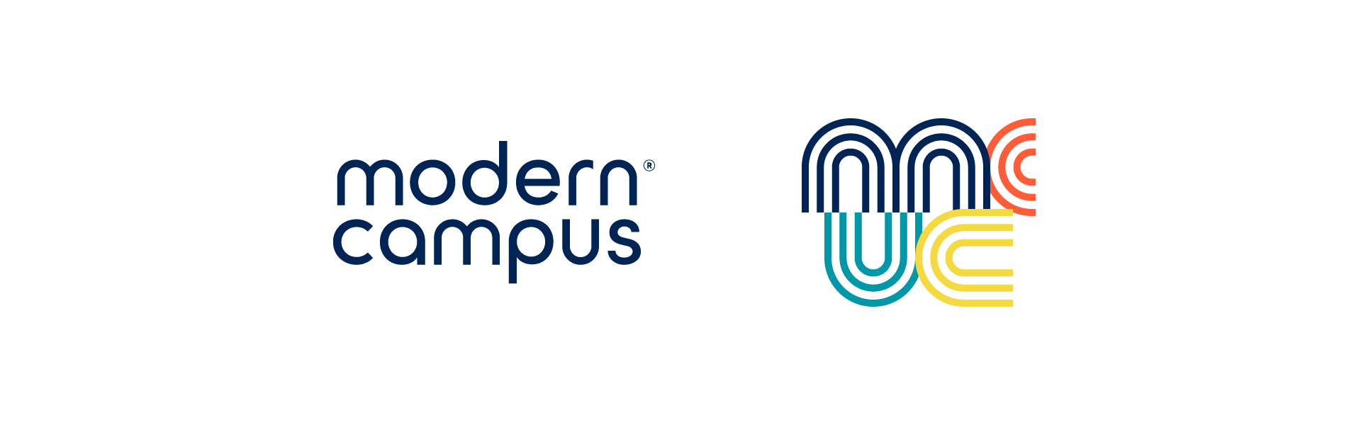
As part of the Modern Campus brand, my focus was to establish a unique event visual identity that was fun, inviting, scalable, and recognizable while remaining cohesive to the Modern Campus brand overall.
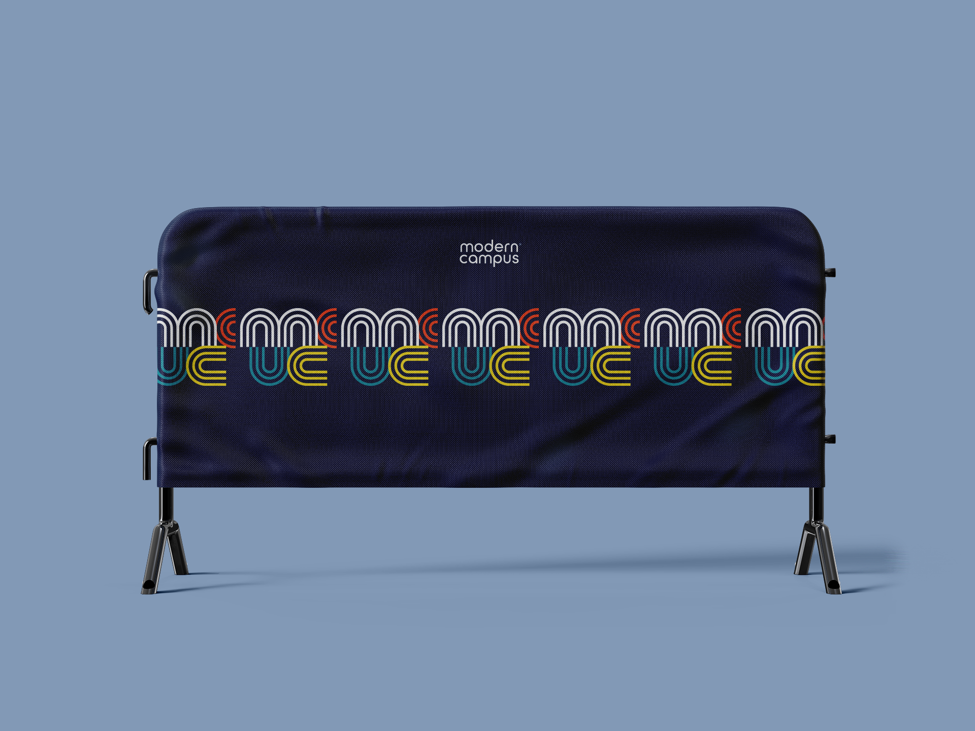
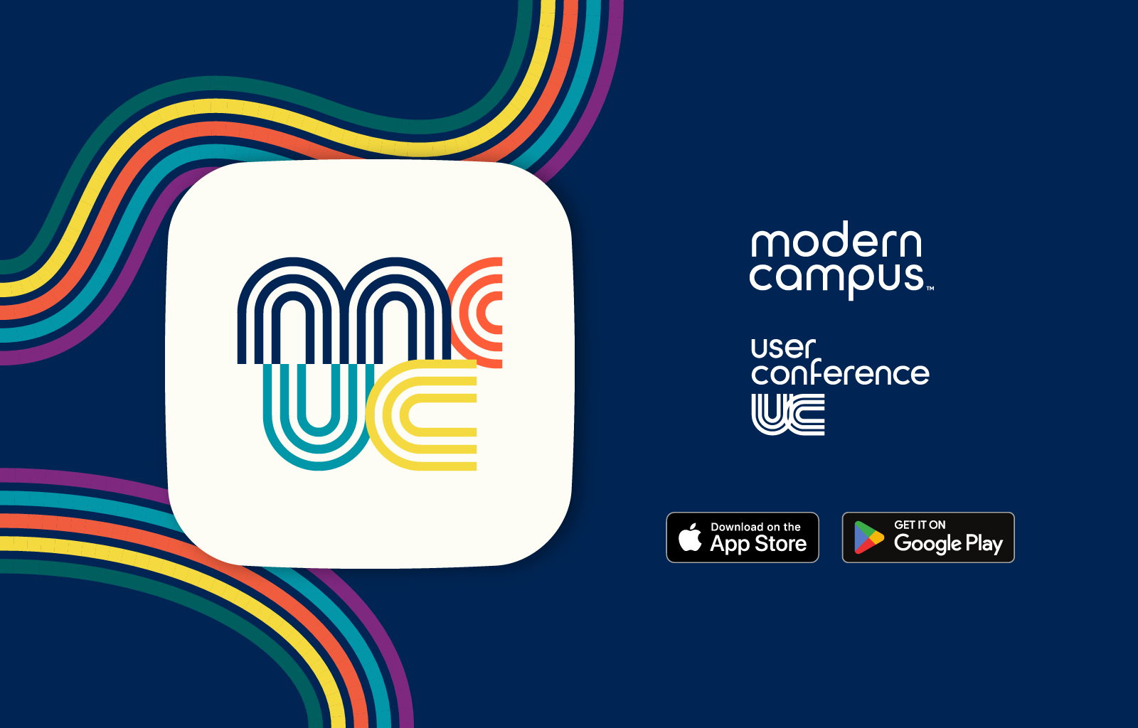
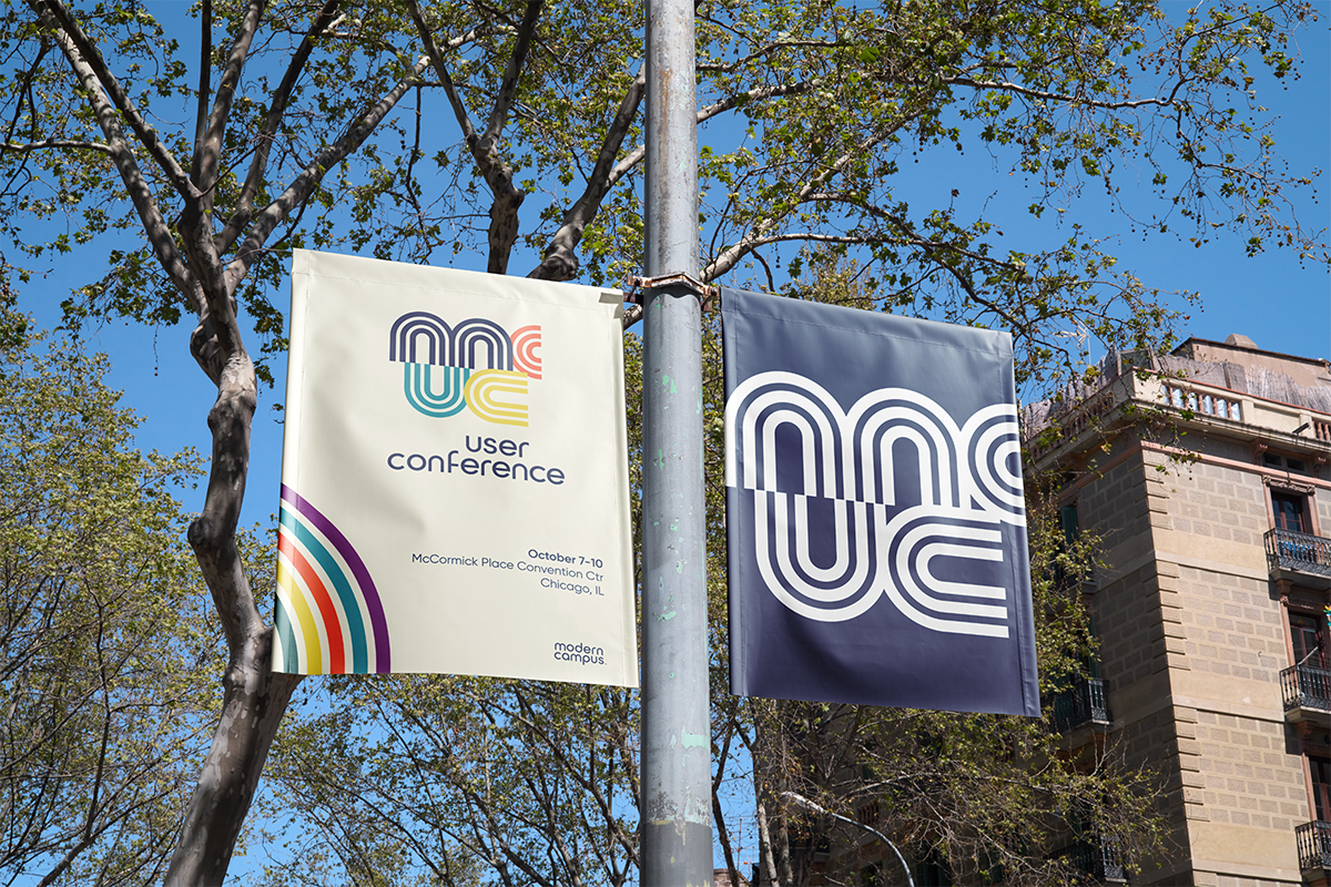
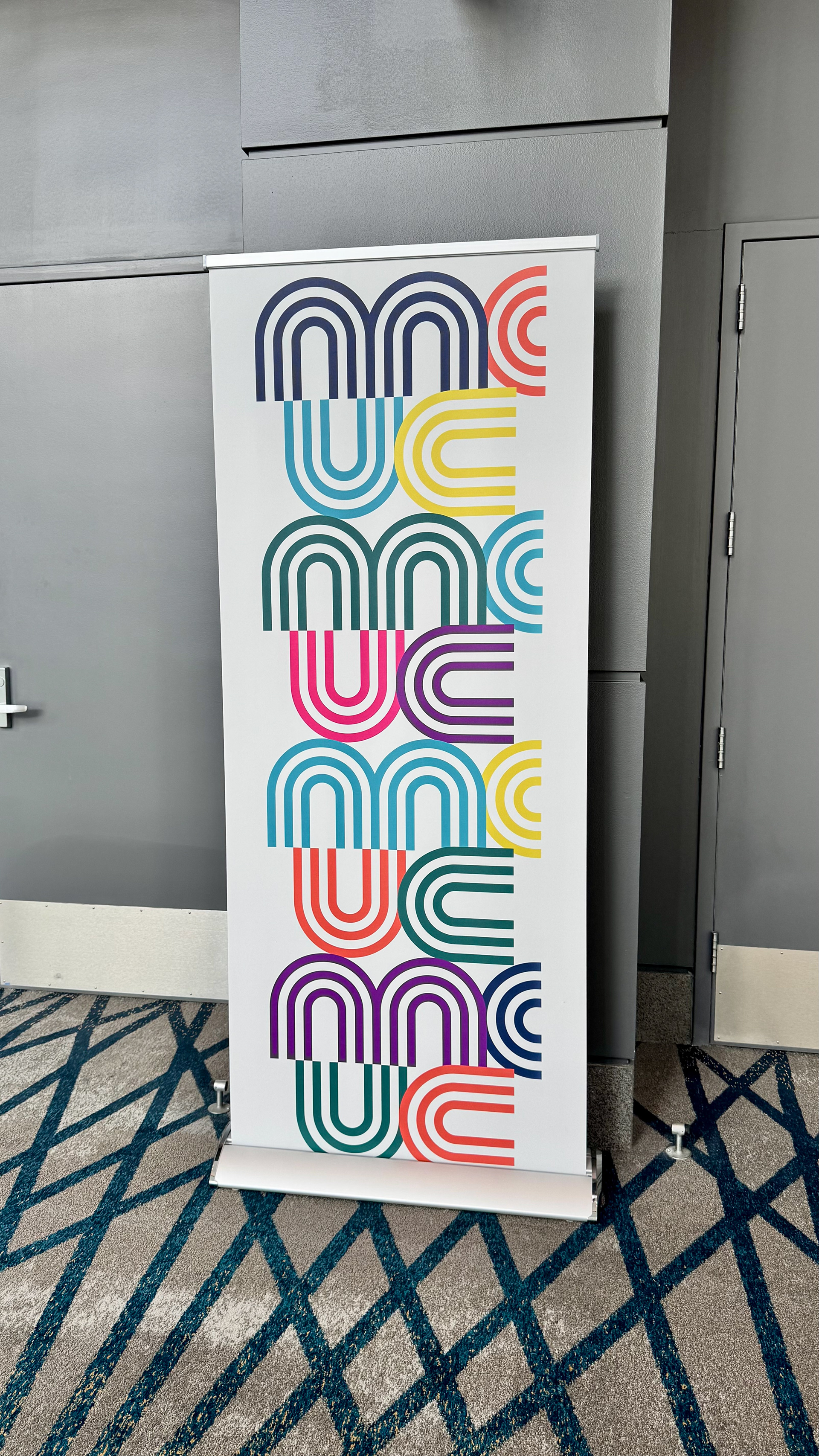
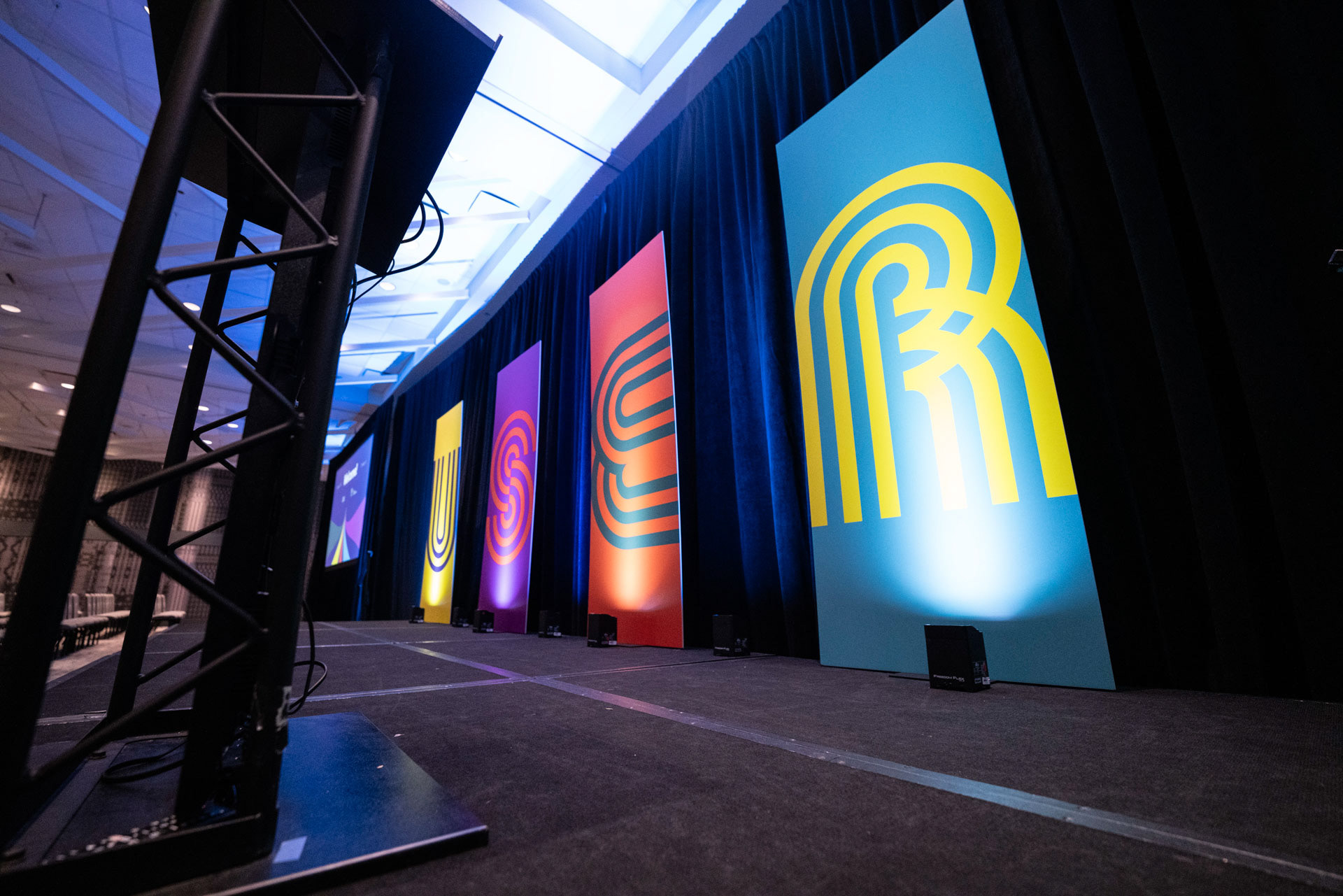
I began with the Modern Campus logo, and noted its swooping letterforms. While experimenting with the typography, I discovered a distinct method of using a multi-stroked "ribbons" type expression that both mirrored the Modern Campus shape language, and symbolized all of Modern Campus' product solutions through line and color, as well as the relationship with our brand vision: Powering the Lifelong Learner Journey, from First Click to Career Credential.
In most cases, the logo does not make the brand...
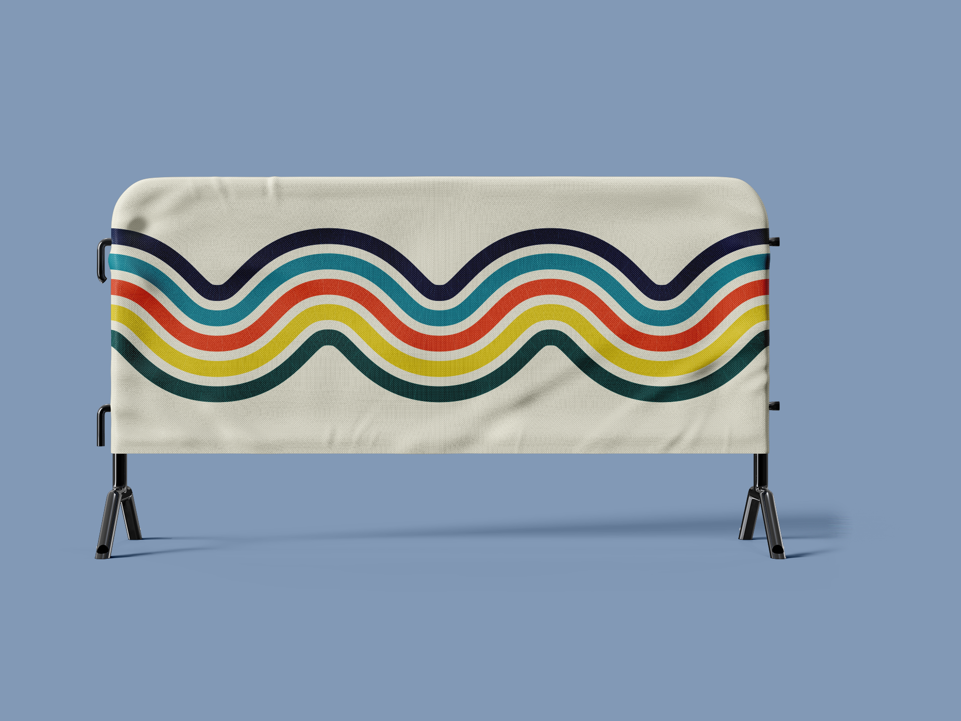
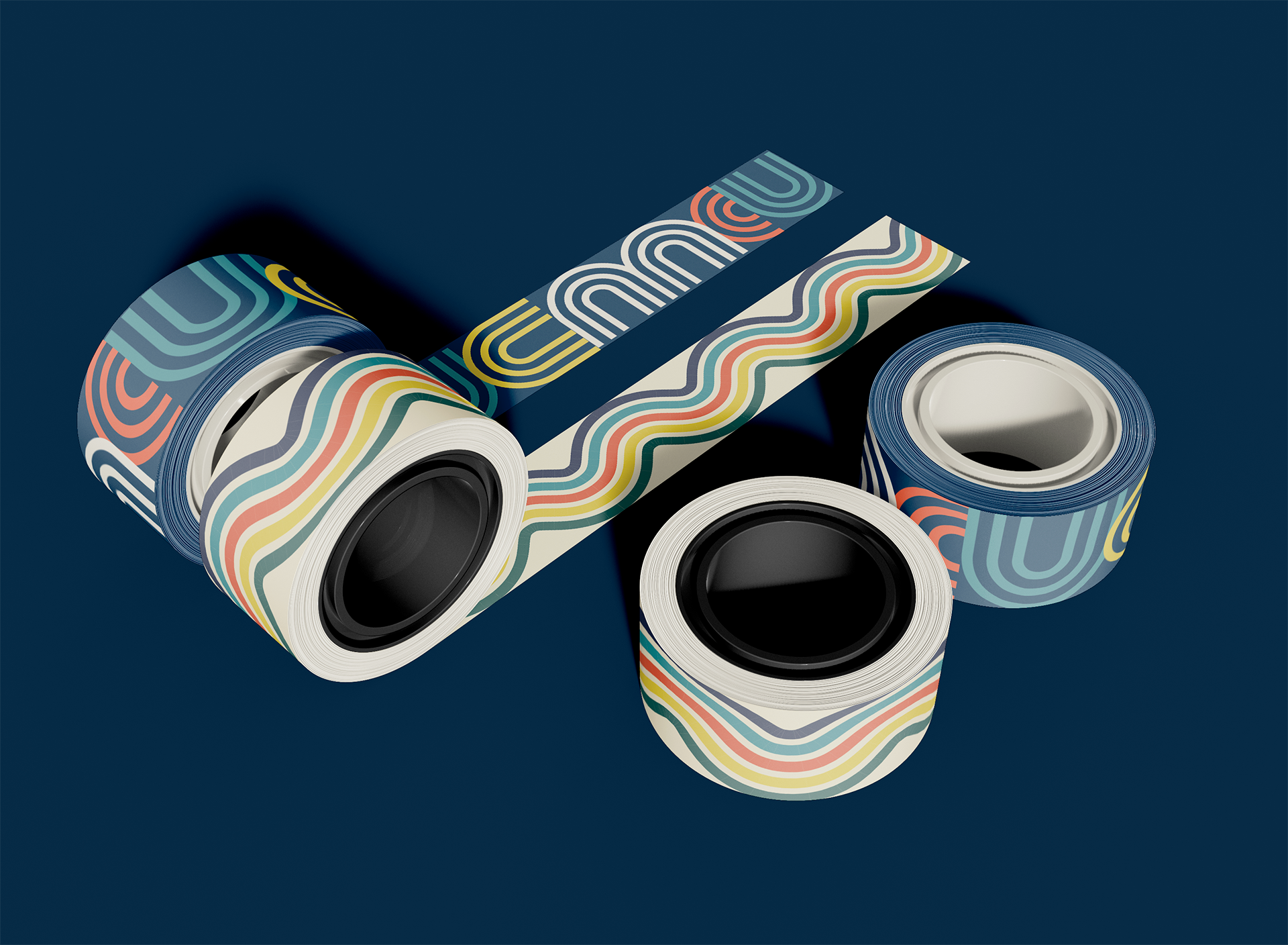
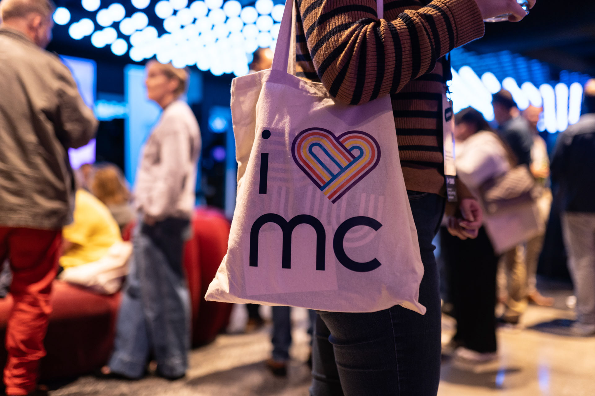
But in this instance, the adaptability of the strokes became just that. What started as a simple monogram turned into a modular, expressive symbol of our suite of products flowing together seamlessly. The multicolor ribbon weaved its way through our displays, ads, and hearts.


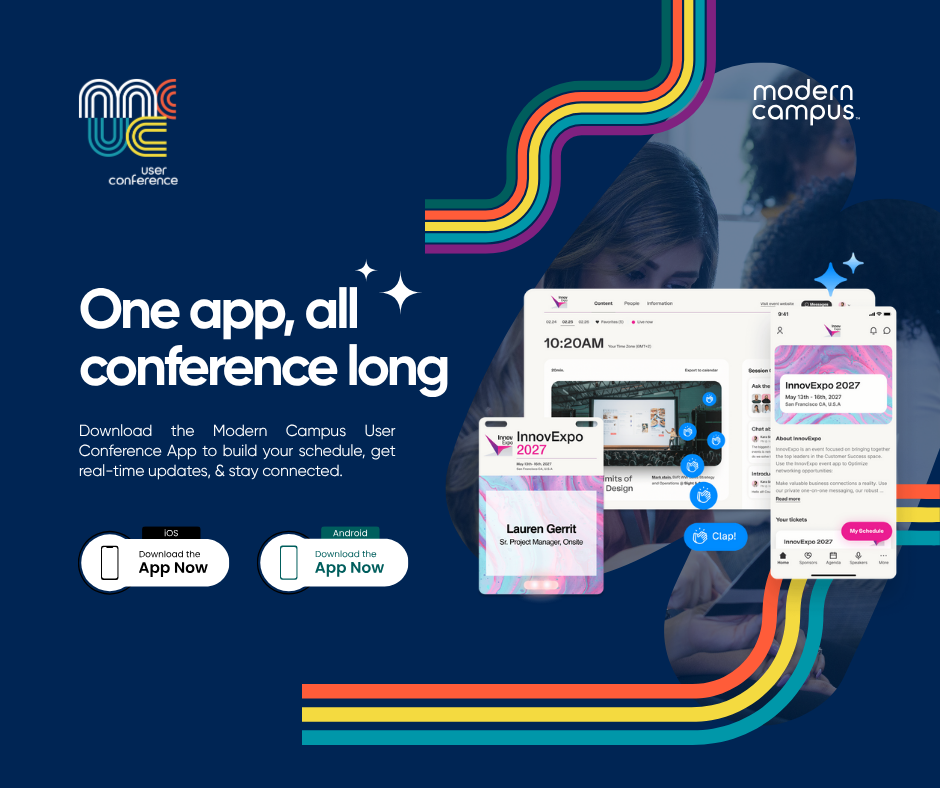
Social media and digital promotion was critical to our mission of hitting our 300 registrant goal, so I developed graphics that were deployed across channels like LinkedIn, Facebook, and Instagram.
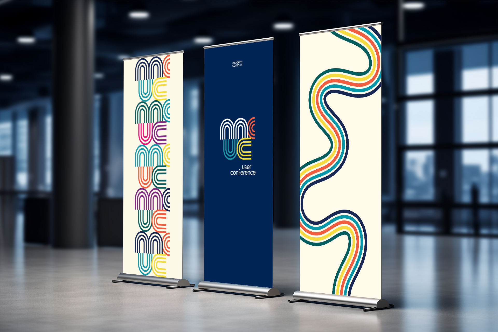
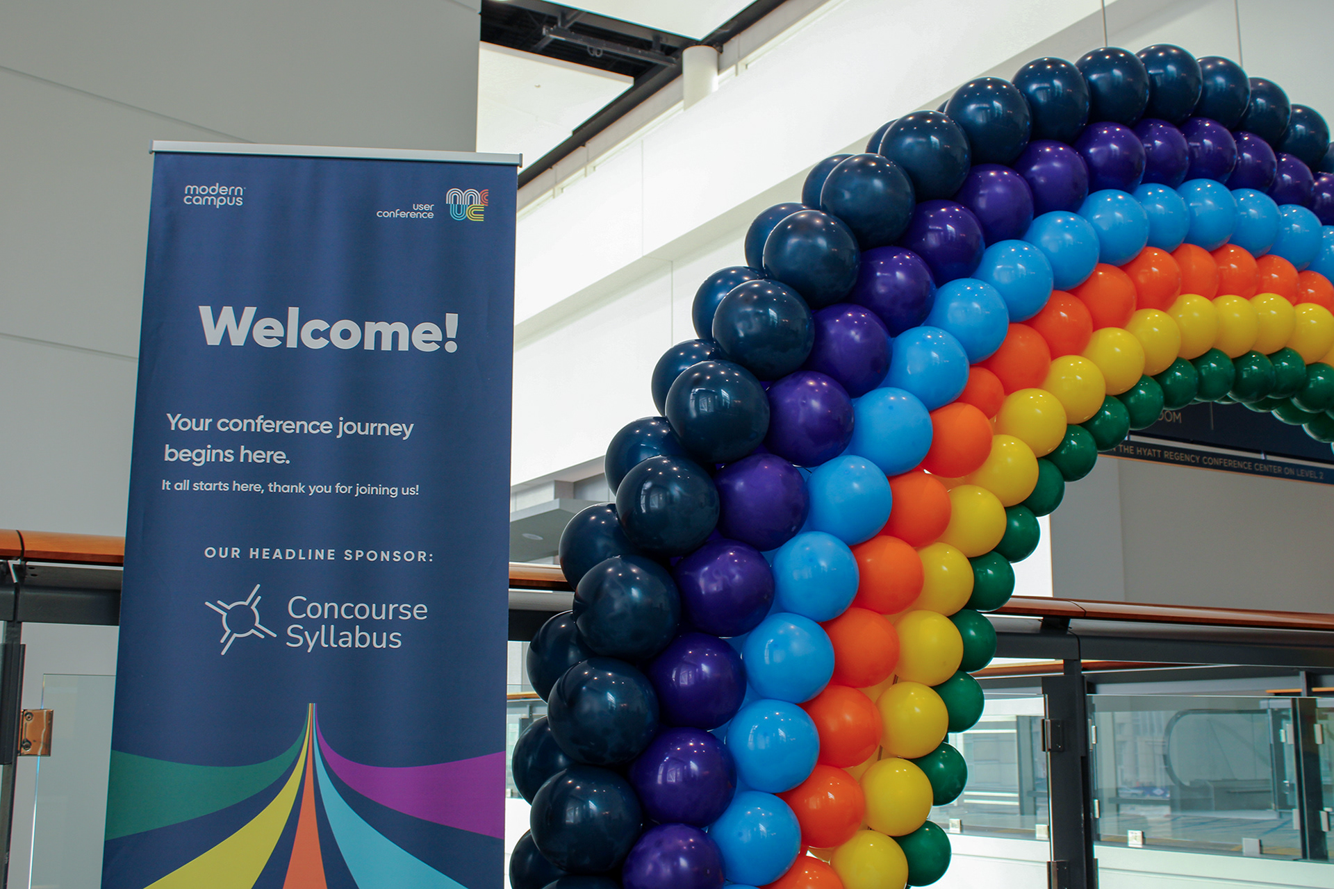
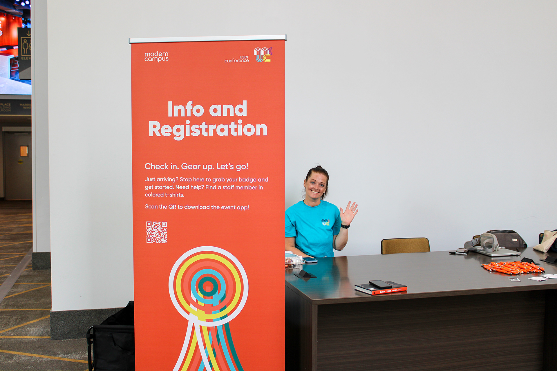
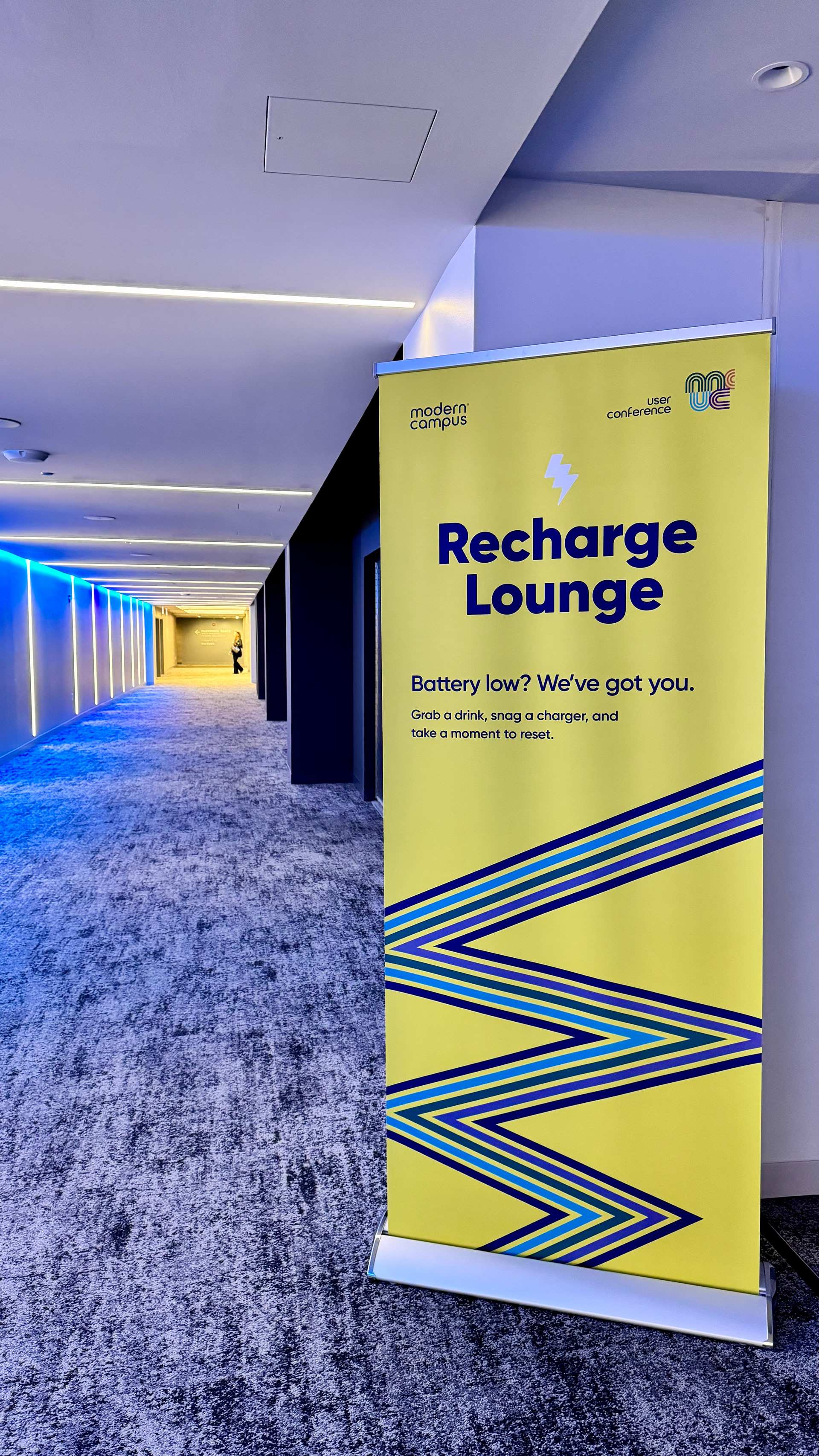
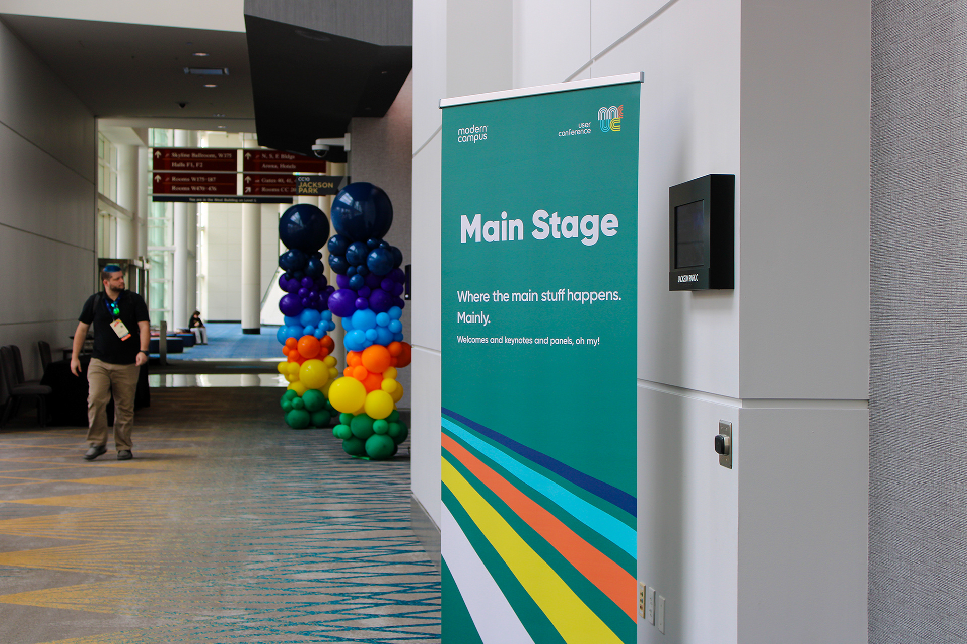
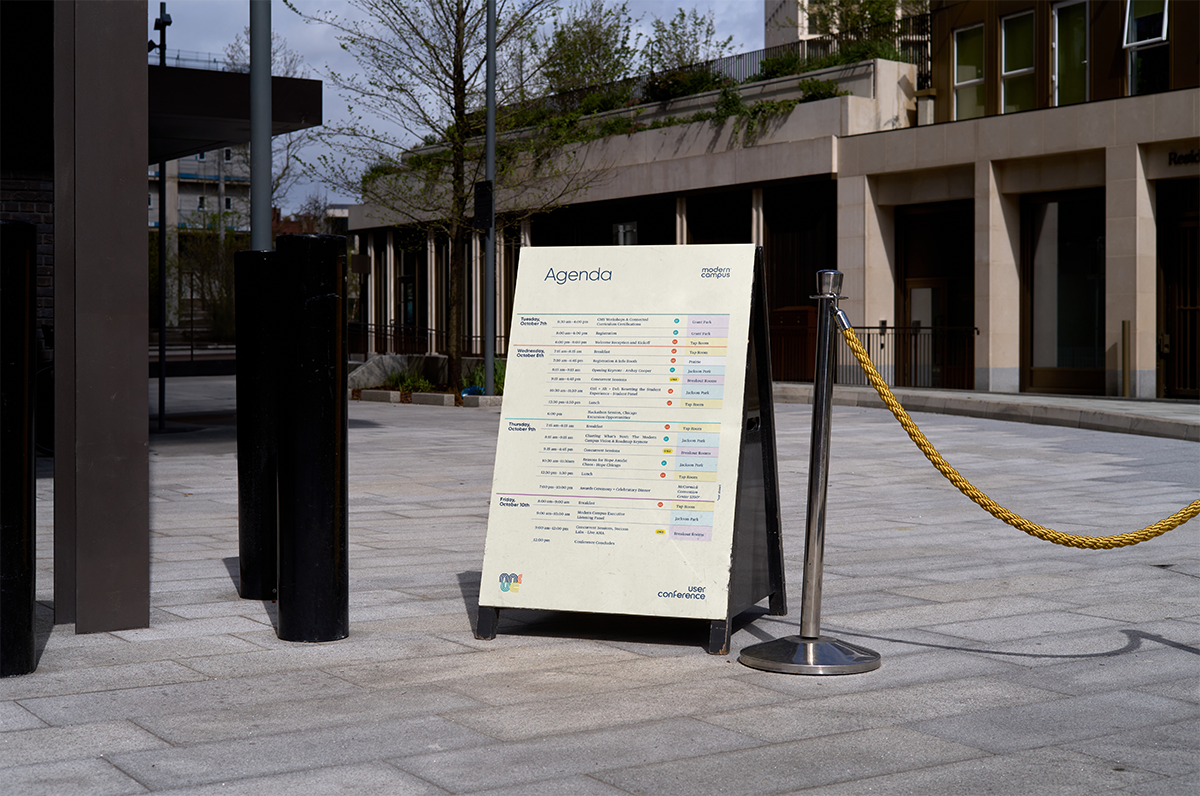
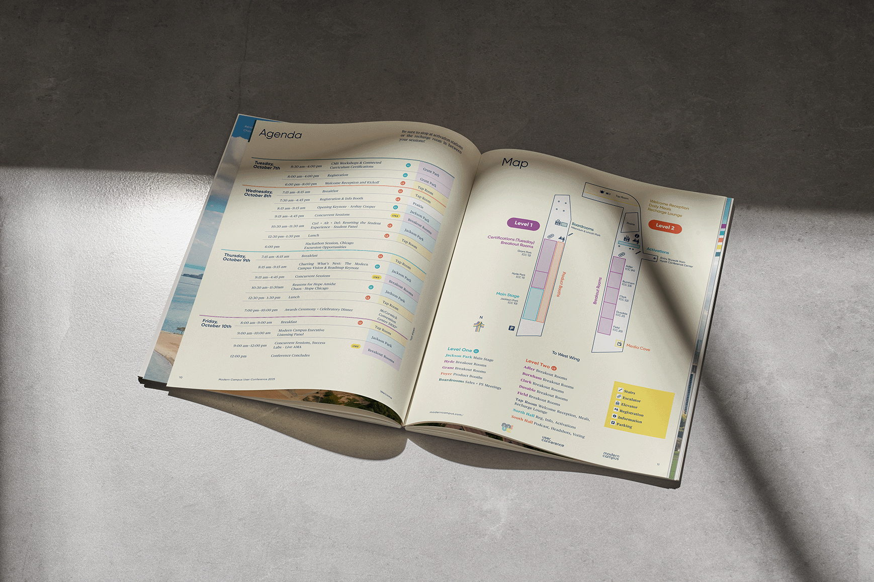
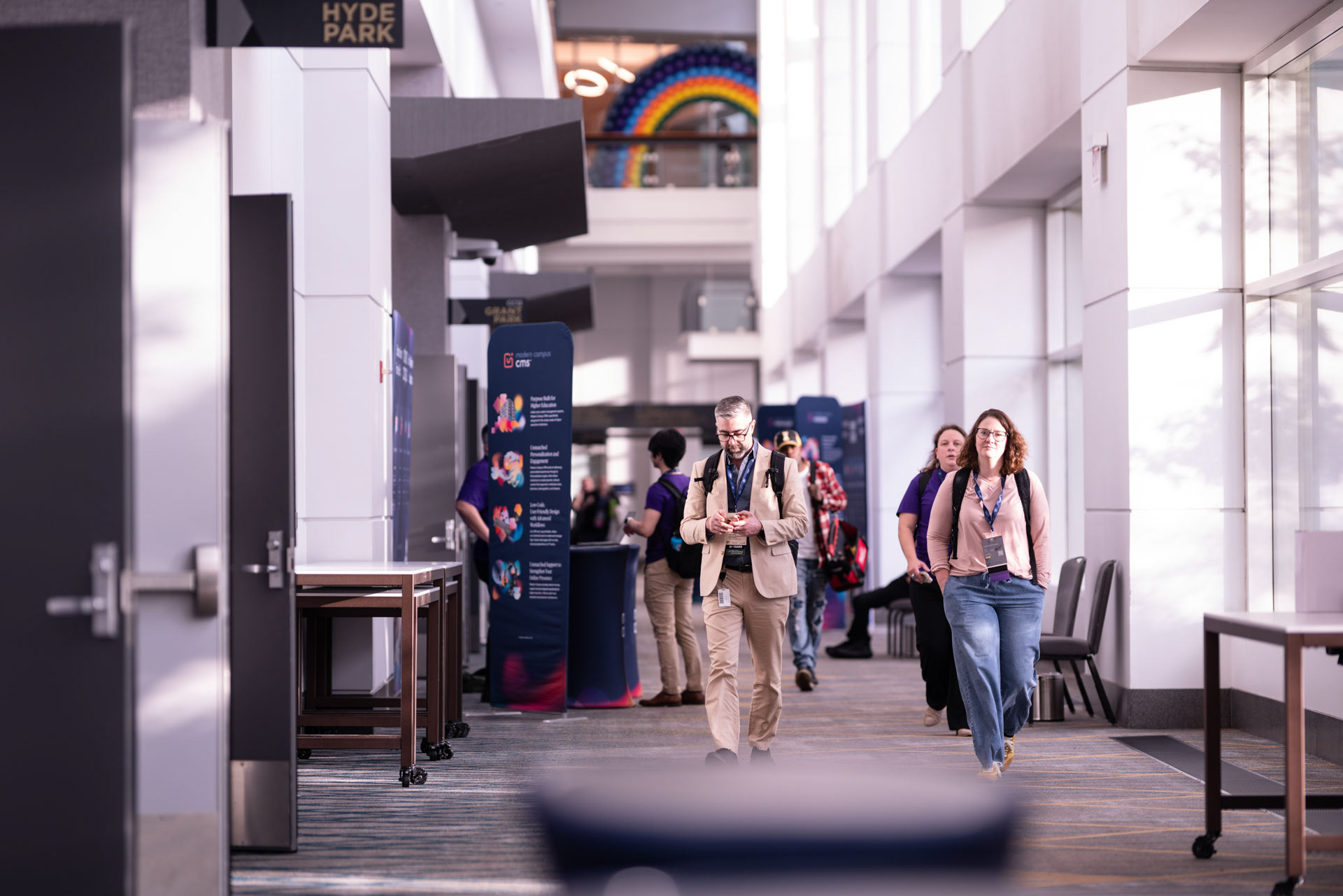
Spacial navigation and way finding was important, because the layout of the conference center was confusing for some attendees. I created several standing banners that were movable to adapt to our needs, and economical to adapt to our budget. We placed banners in strategic locations so there was always something within view.

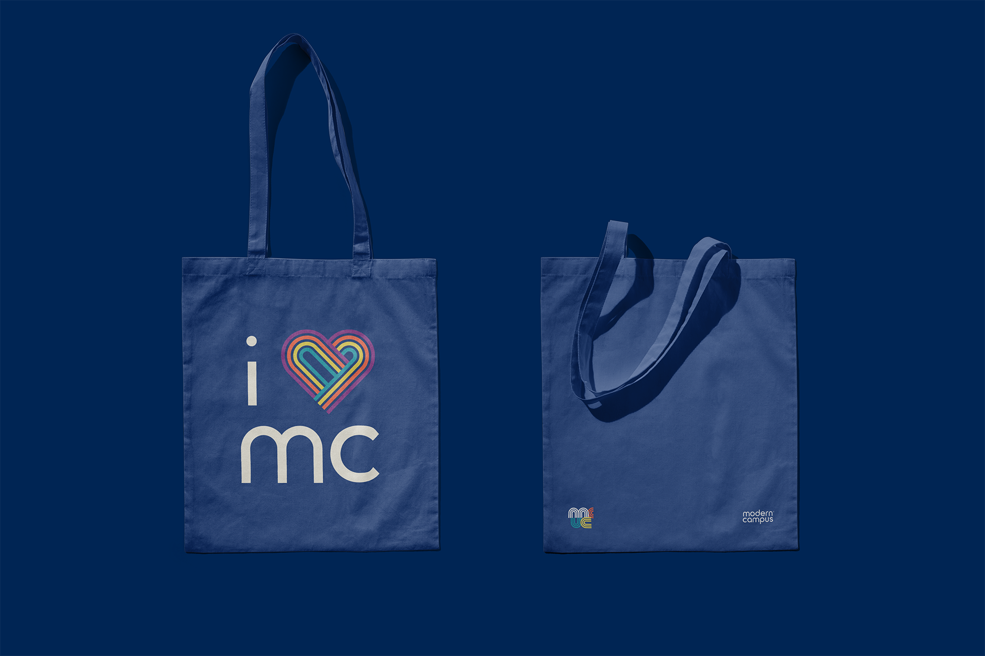
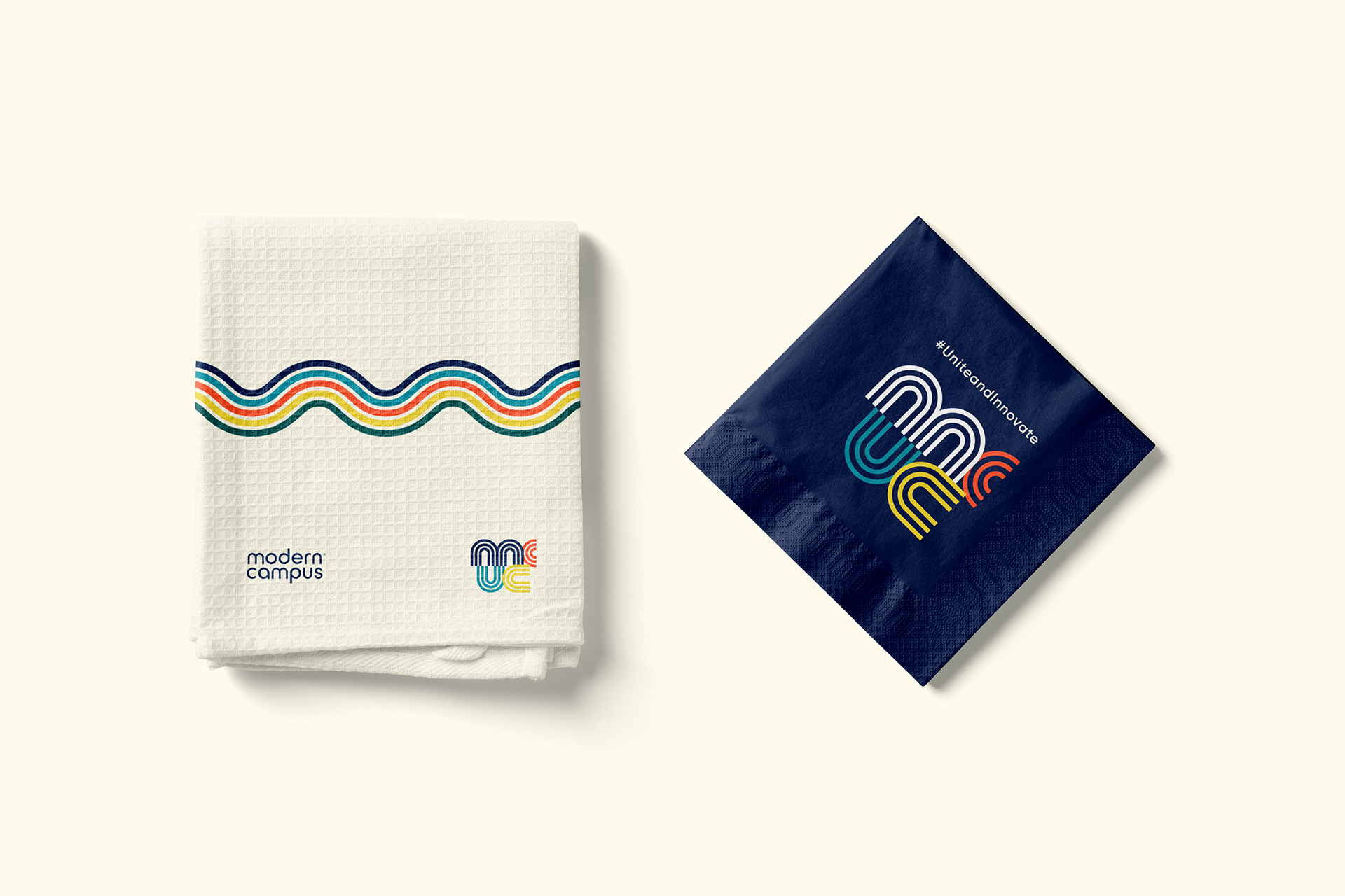
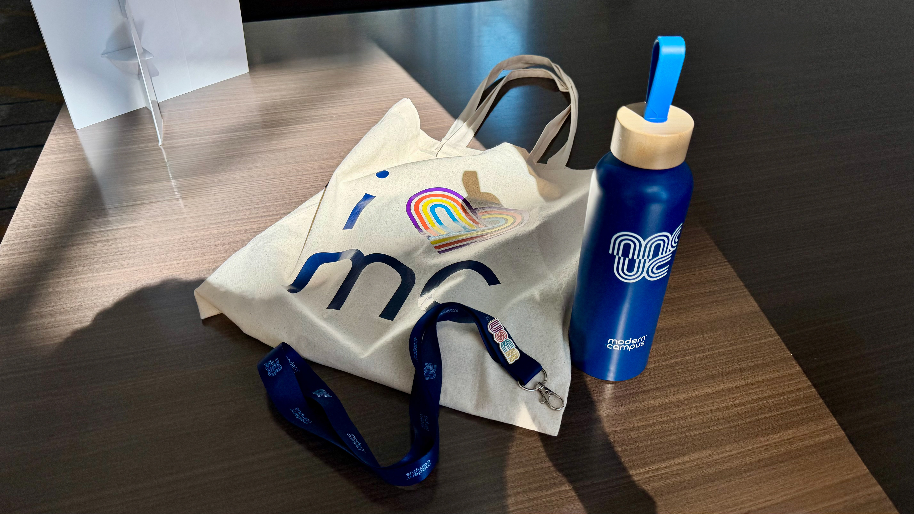
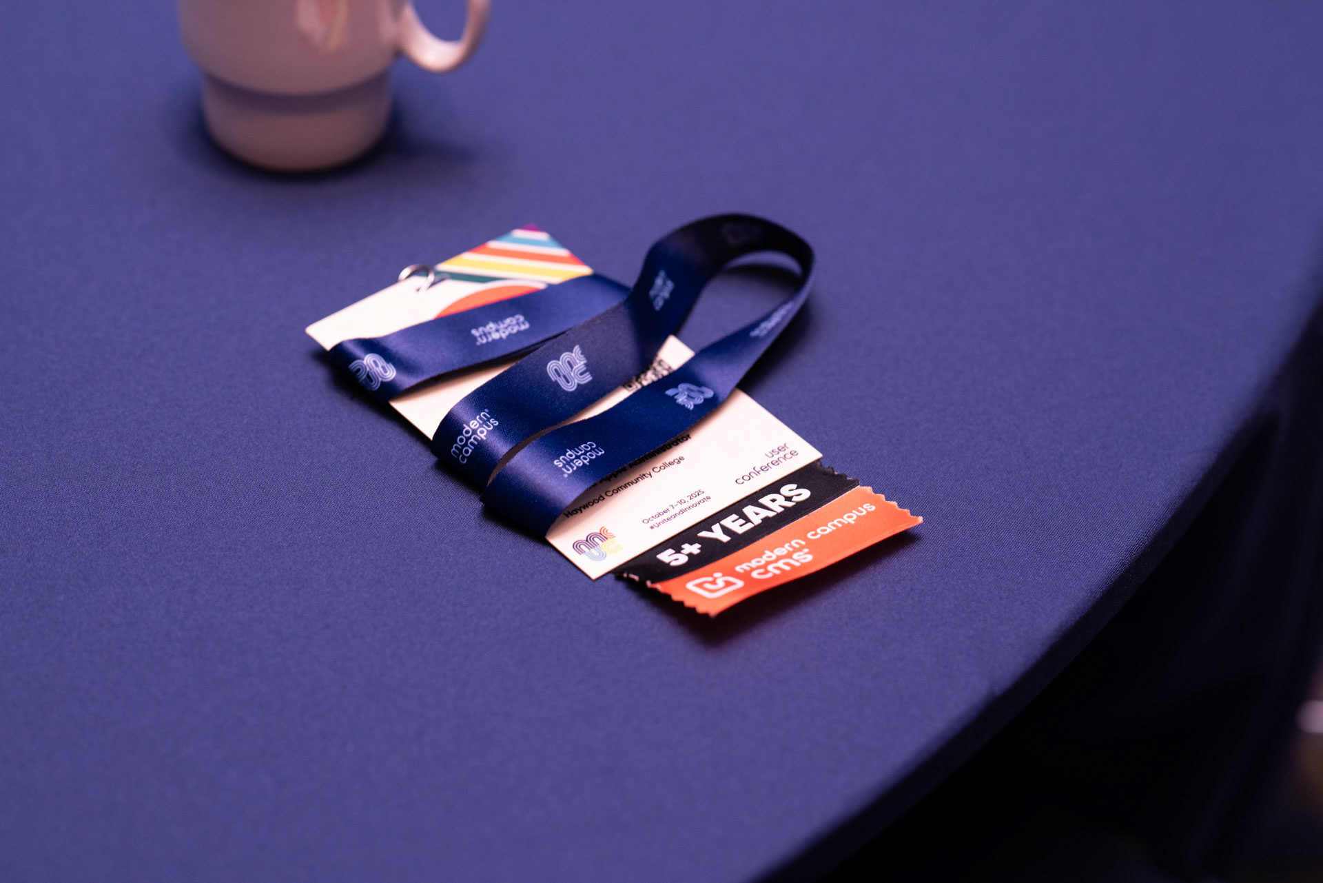
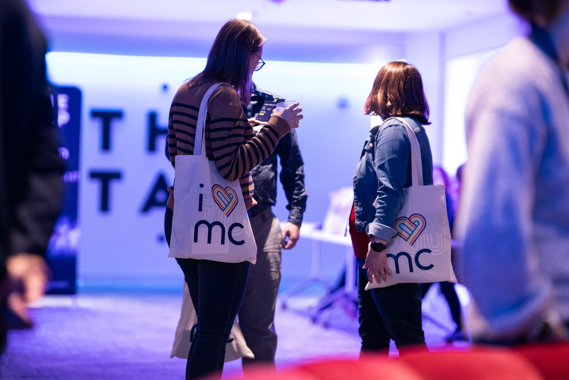
Because we value our customers, we put together a swag bag of branded items to show off at the event and take home as a keepsake. I worked closely with fabricators and printers to ensure we were getting the best quality for the value. The night before the conference the team and I were up late stuffing bags and preparing for registration.
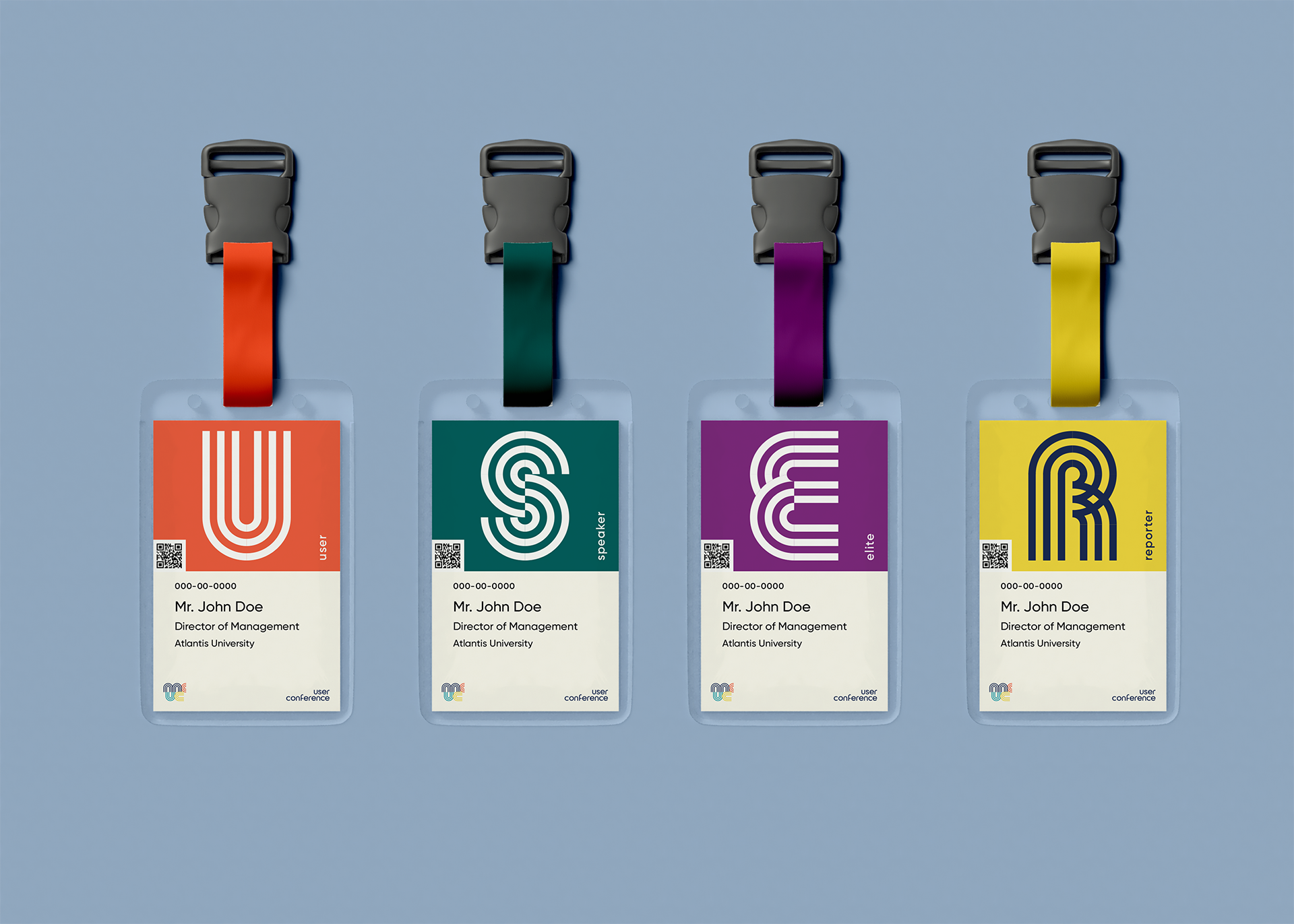
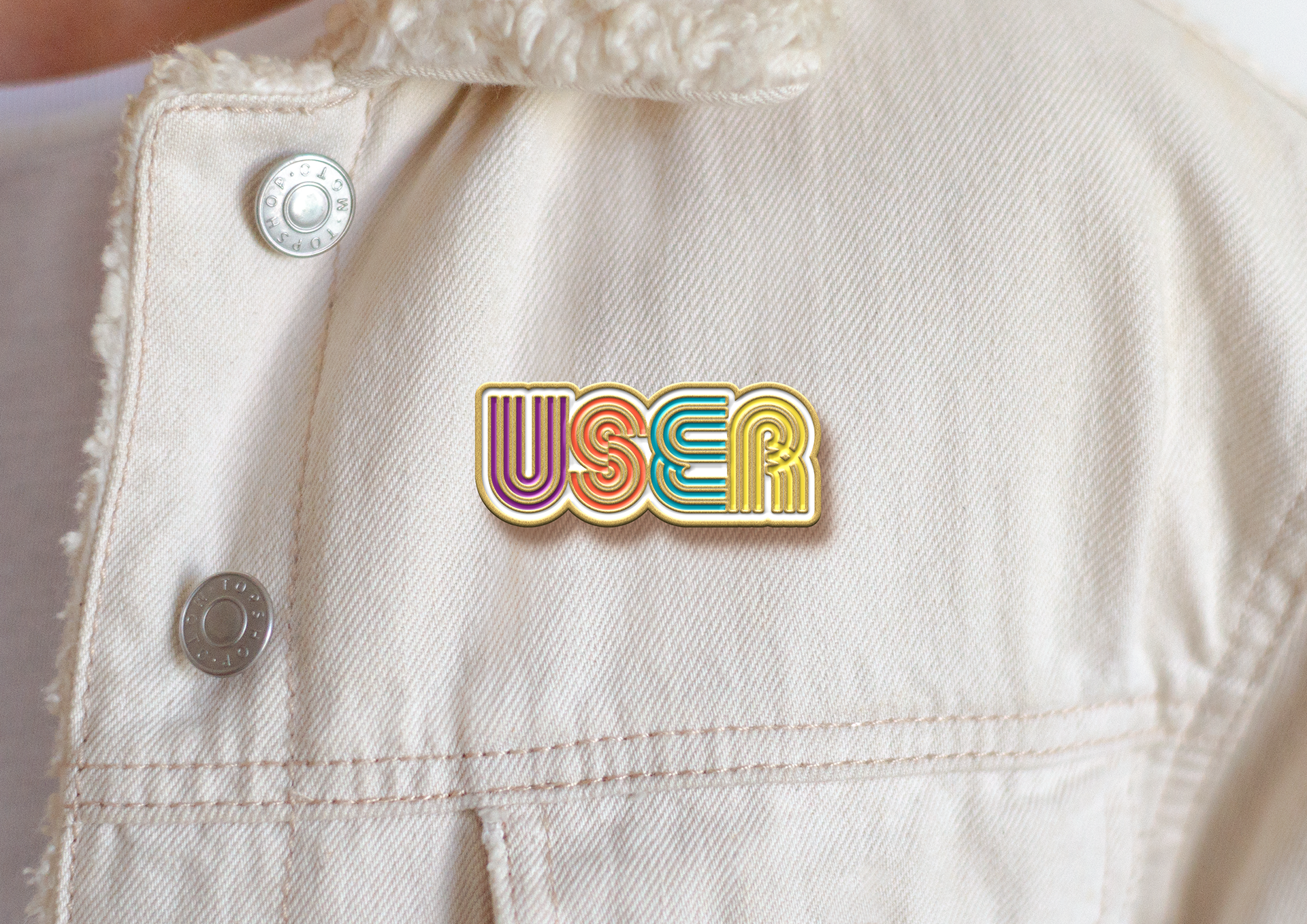
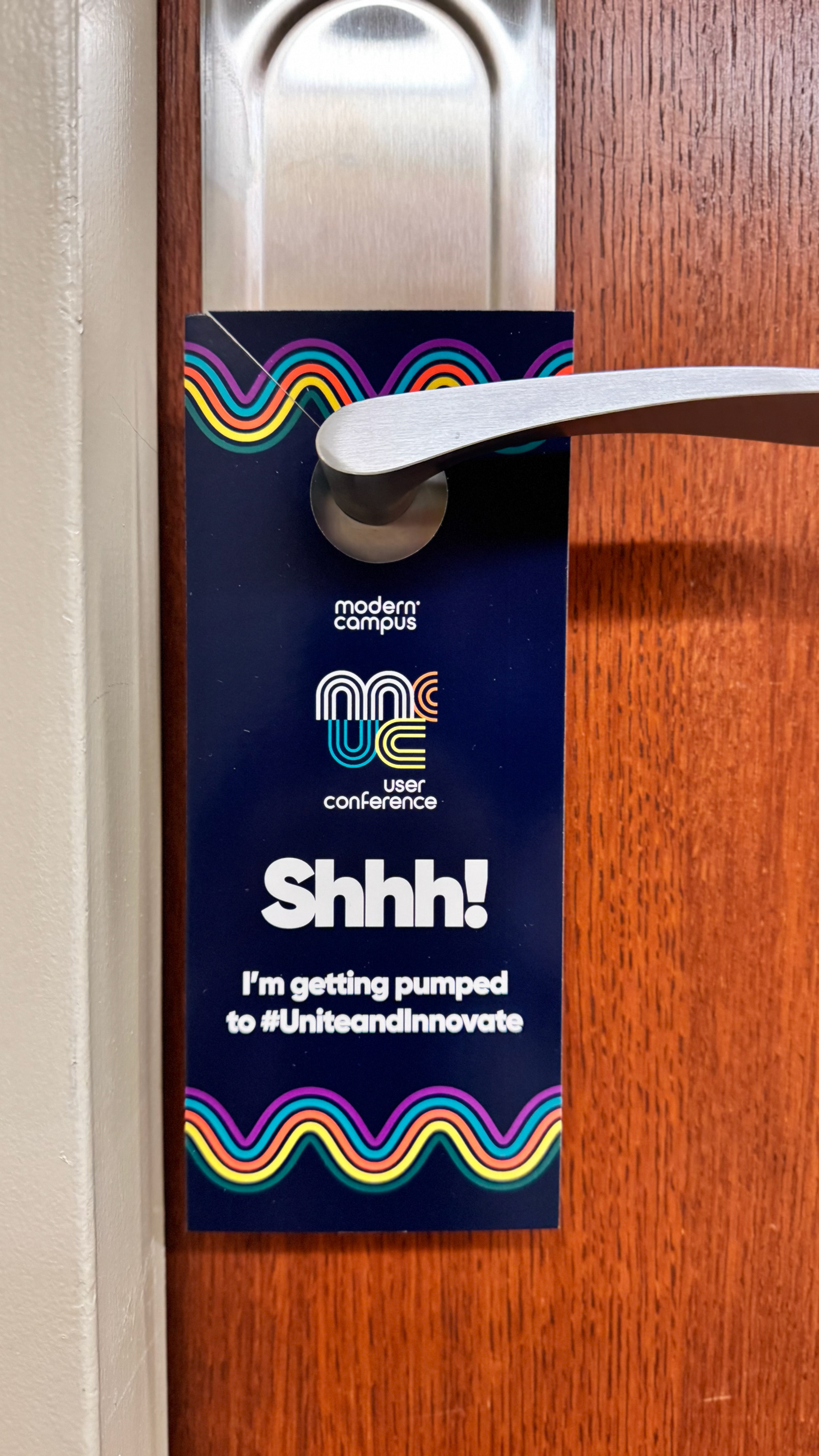
Included was a "USER" enamel pin, booklet full of conference information, and a door hanger for attendees to check off their registration to-dos (and to act as a branded "Do Not Disturb" sign) which brought activation between the hotel and conference experience.
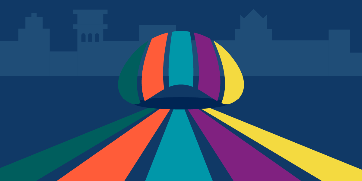
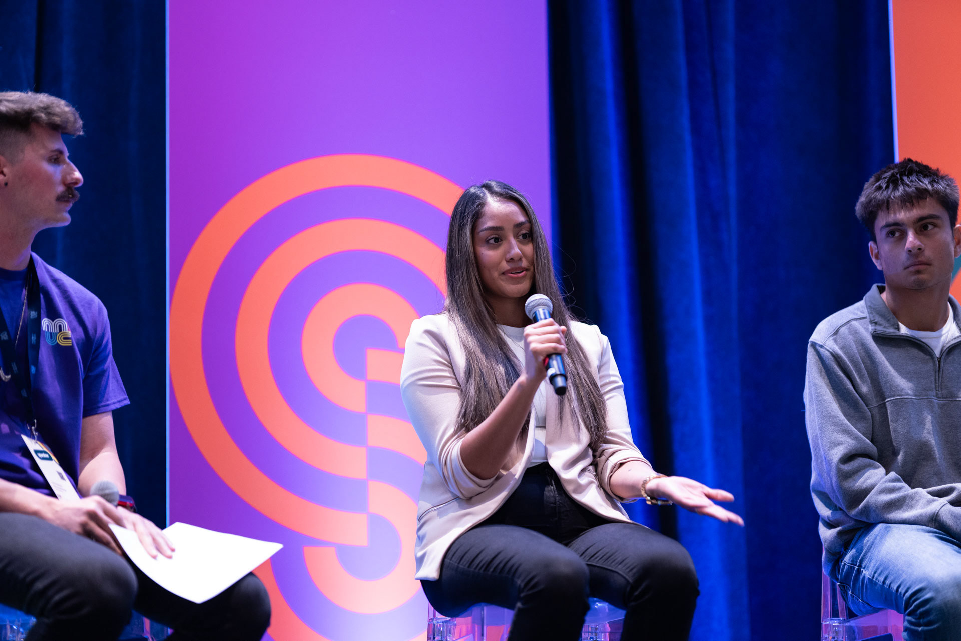
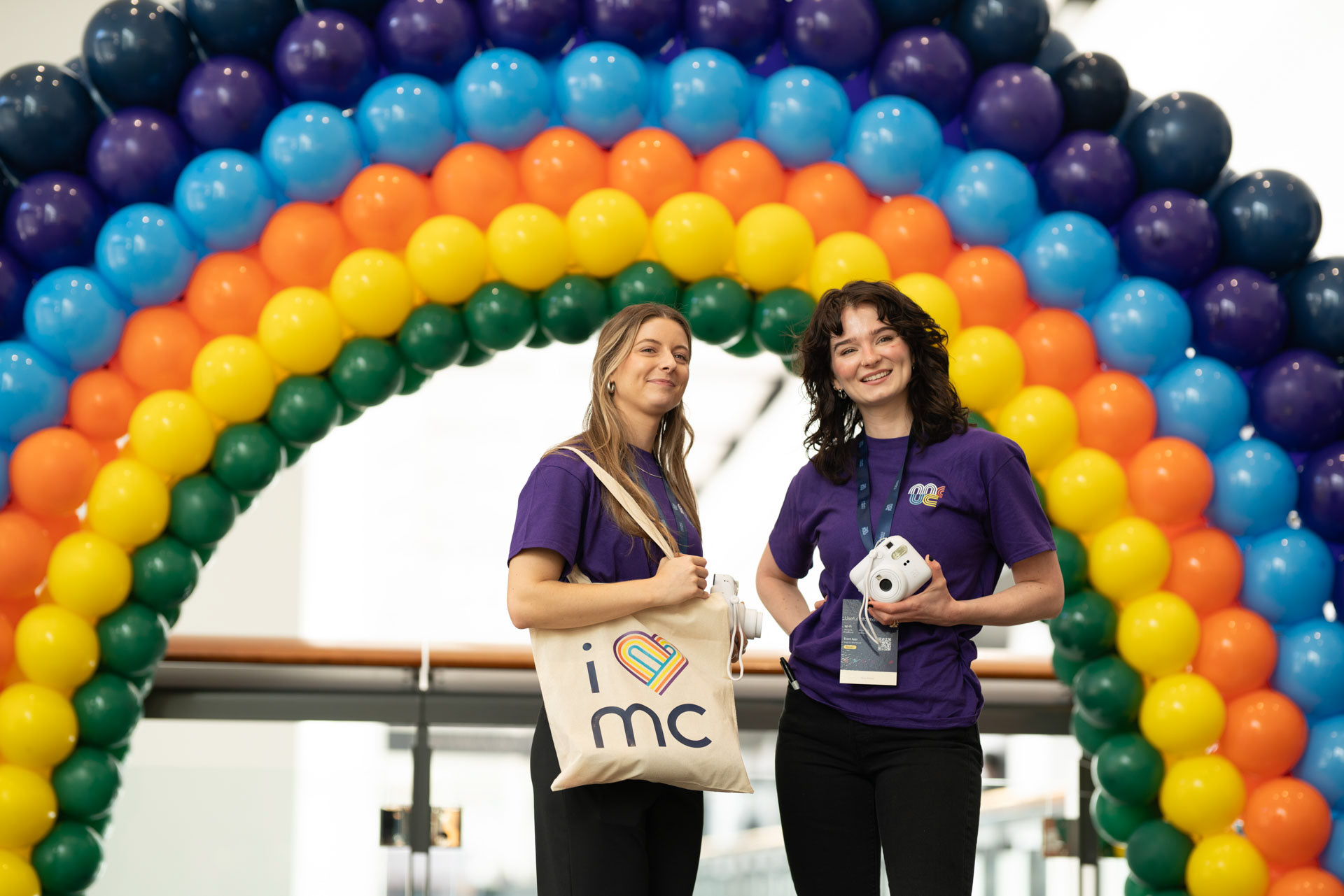
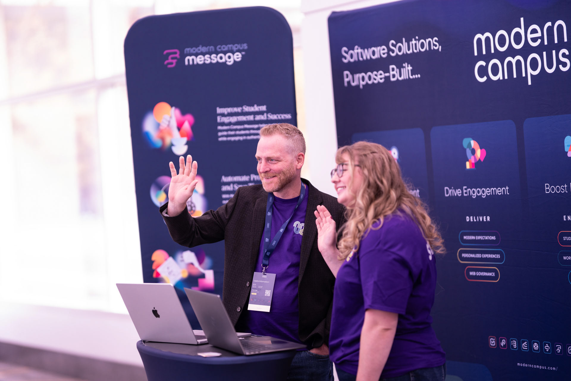
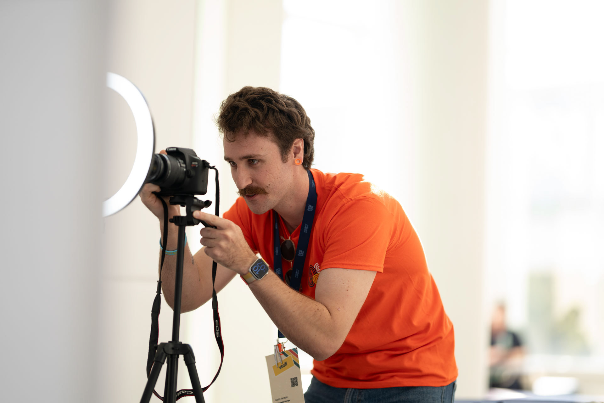
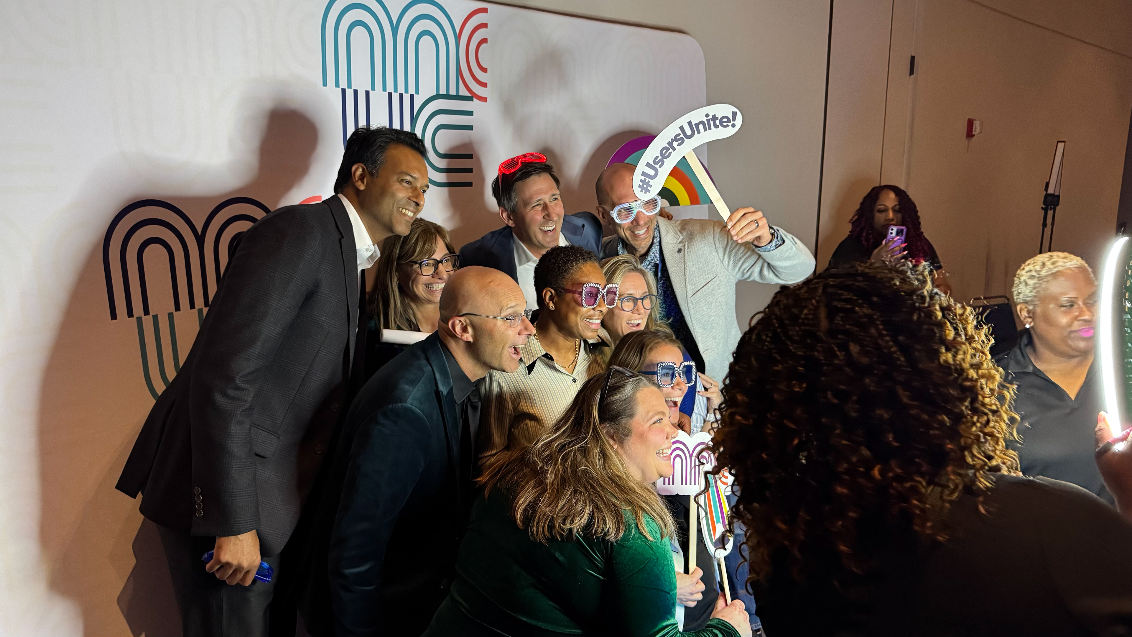
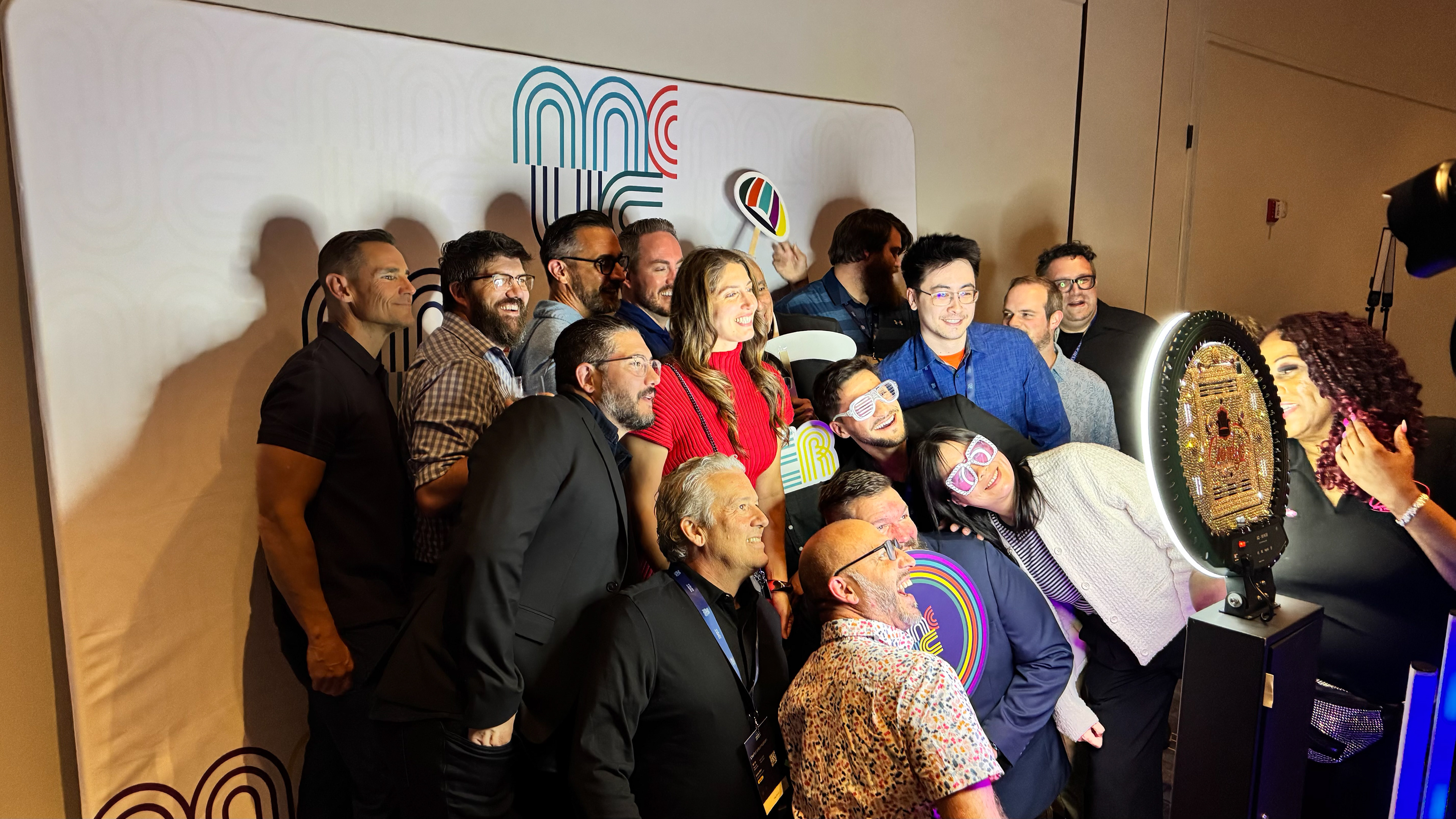
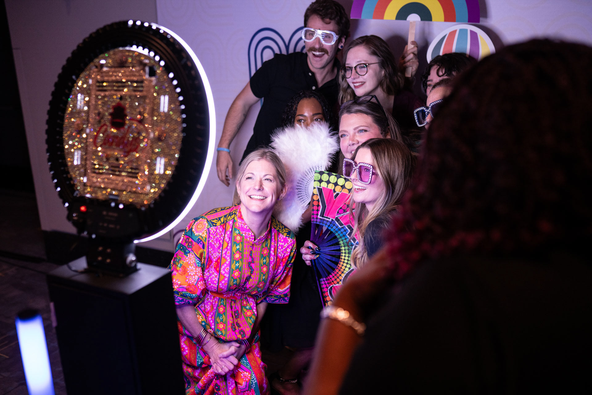
To keep customers engaged when outside of sessions, we offered a handful of activations for customers to take photos, connect, and network together.
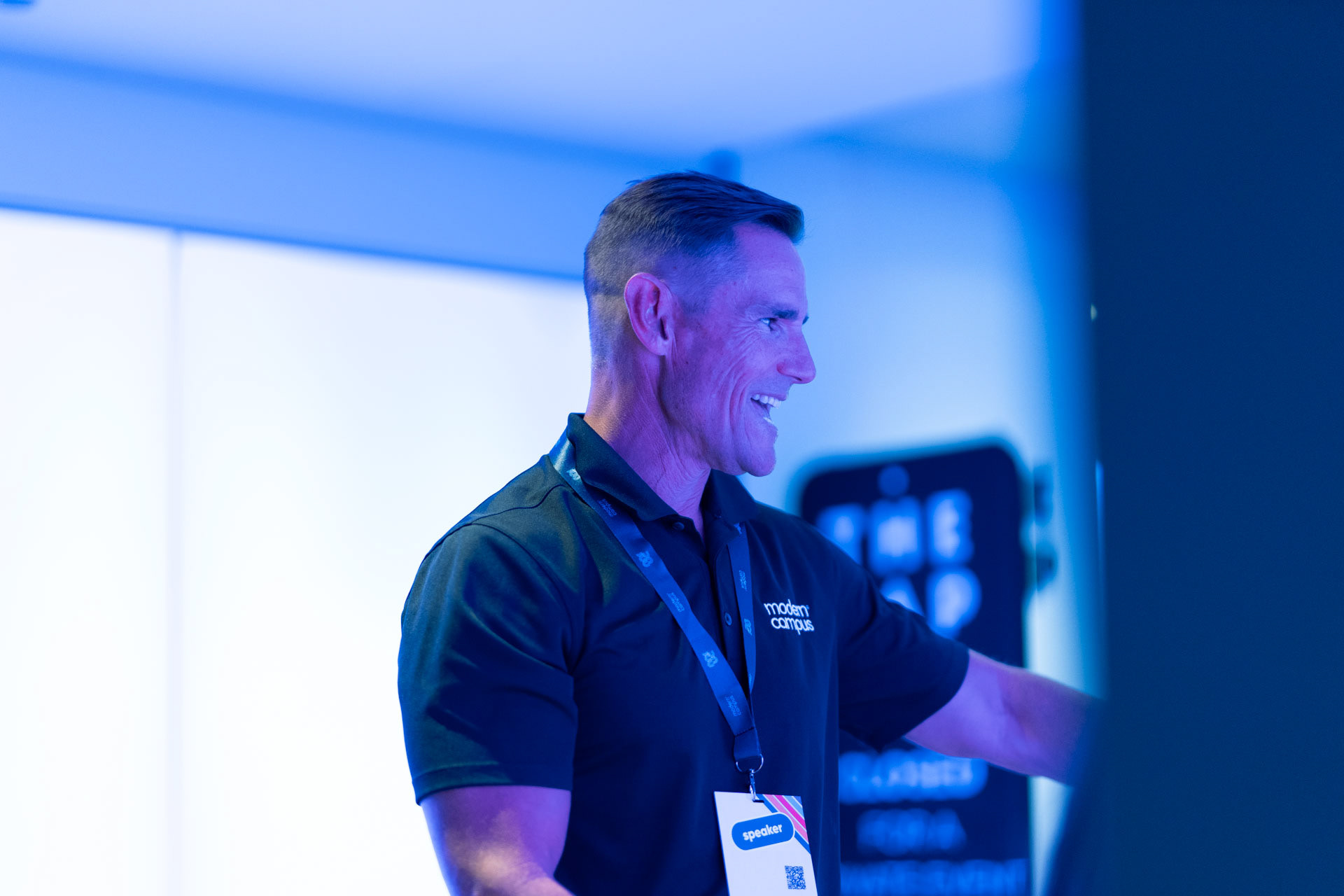
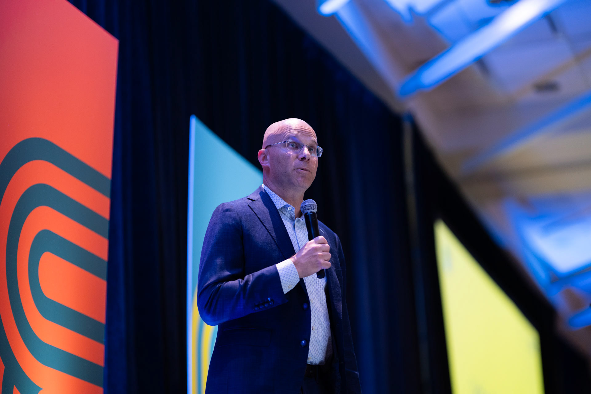
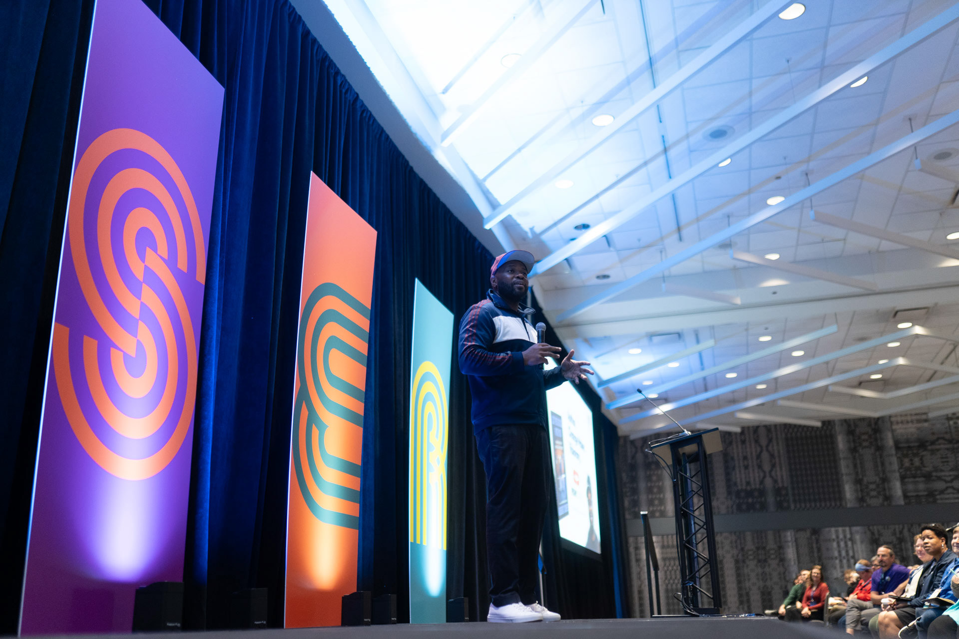
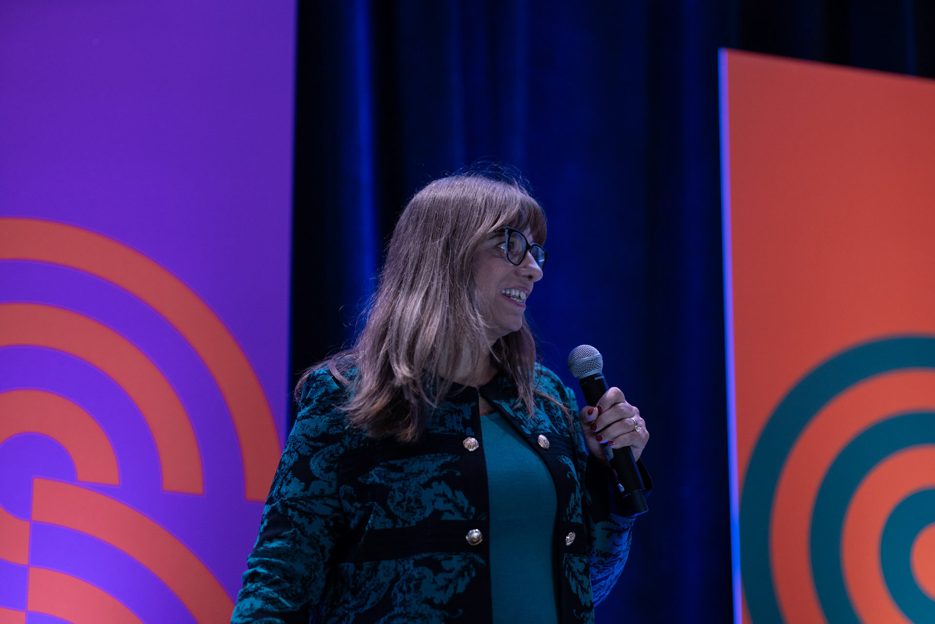
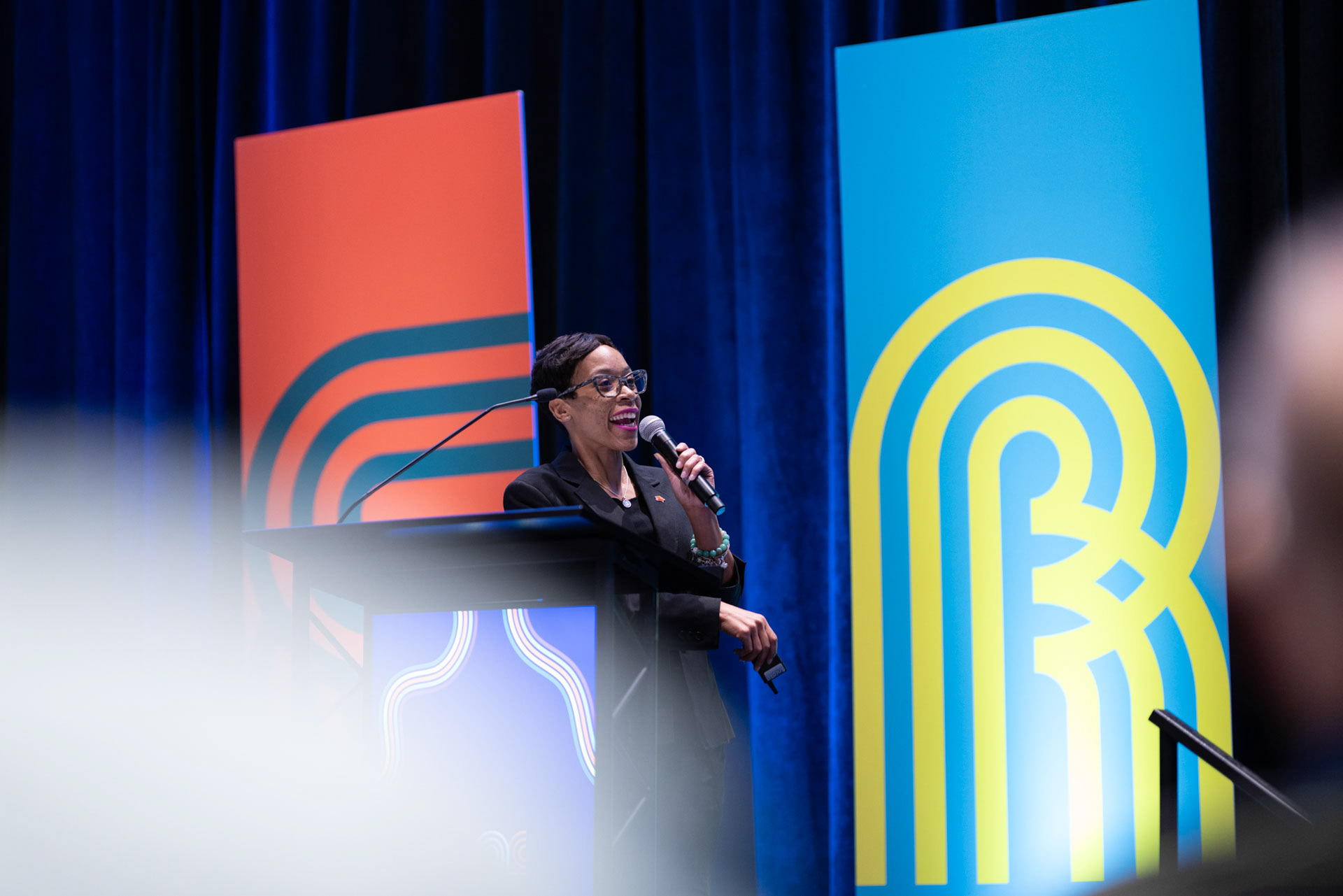
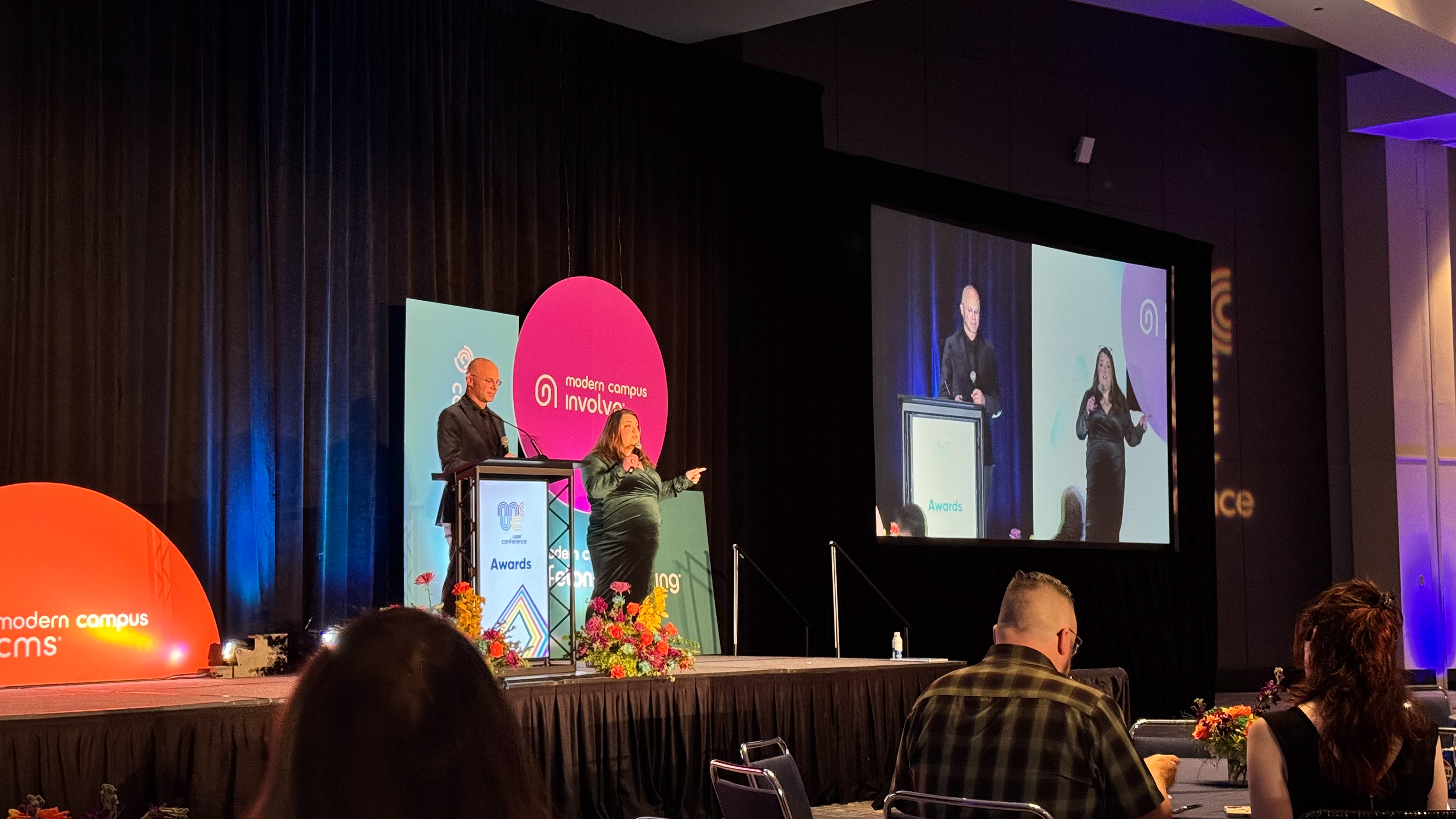
CEO Welcome and Product Roadmap Keynotes were conducted on the Main Stage. I was responsible for deck design and implementation, and worked with AV to ensure smooth presentations and audio.


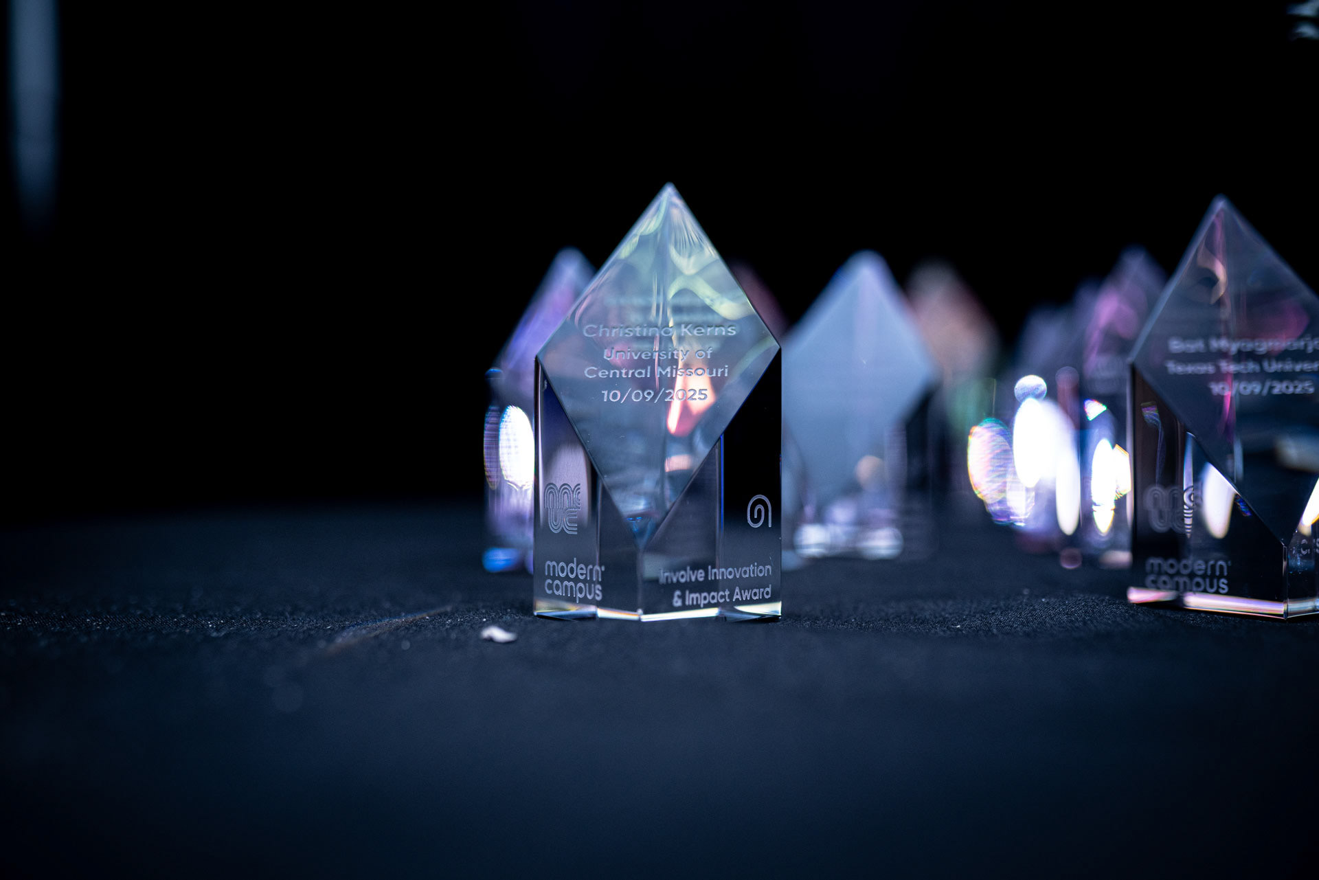
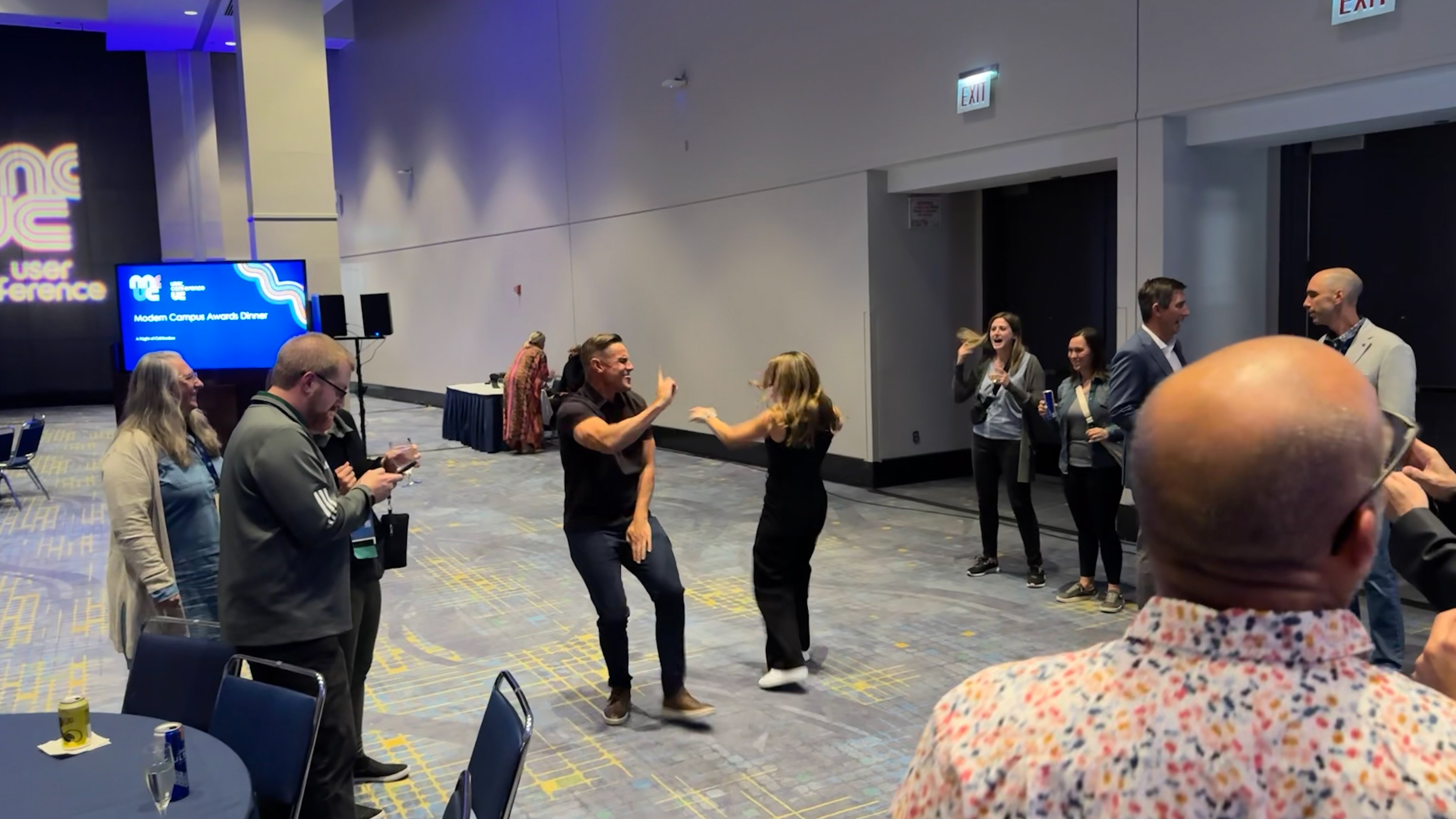
Our Awards Ceremony was a chance for us to recognize exceptional partners and customers for the impact they have made in their communities and workplaces. To create hype and excitement for the night, I created a cinematic-trailer style video about Chicago and paralleled the city's triumphs with Modern Campus'.
The ceremony featured an energy-filled night of connection, recognition, music, food, and dancing. Customers left feeling appreciated and invigorated to be part of the Modern Campus family.
Thank You, Chicago!
astravisum.studio/